Projects
Customers stories
The stories we wrote together with our customers, are impressive. Think what we can achieve together.

MARCIN WIŚNIEWSKI
FOUNDER AND HEAD OF DESIGN
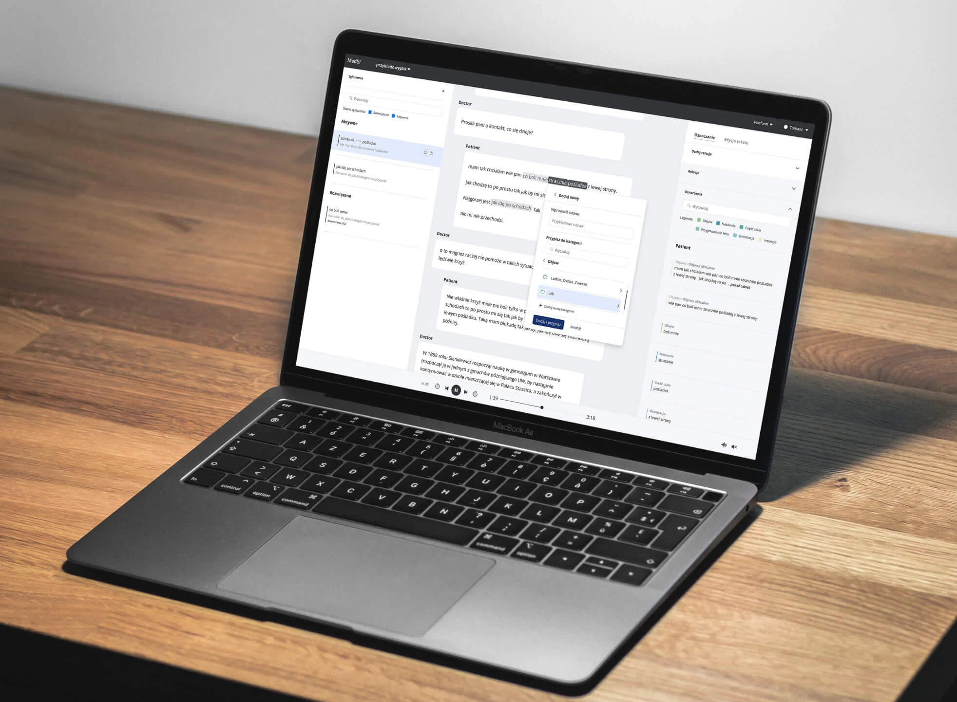
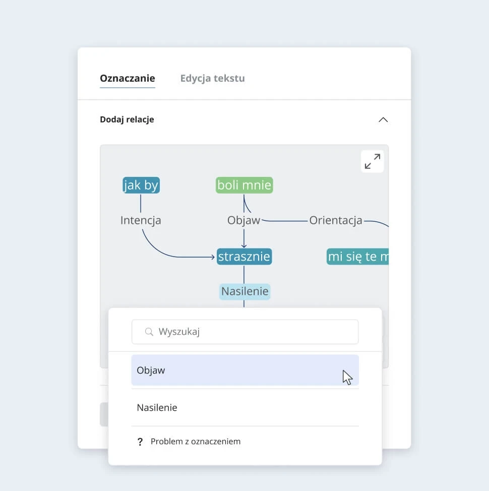
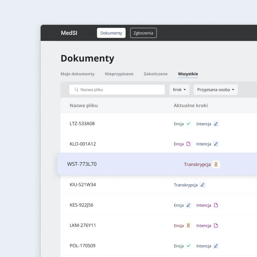
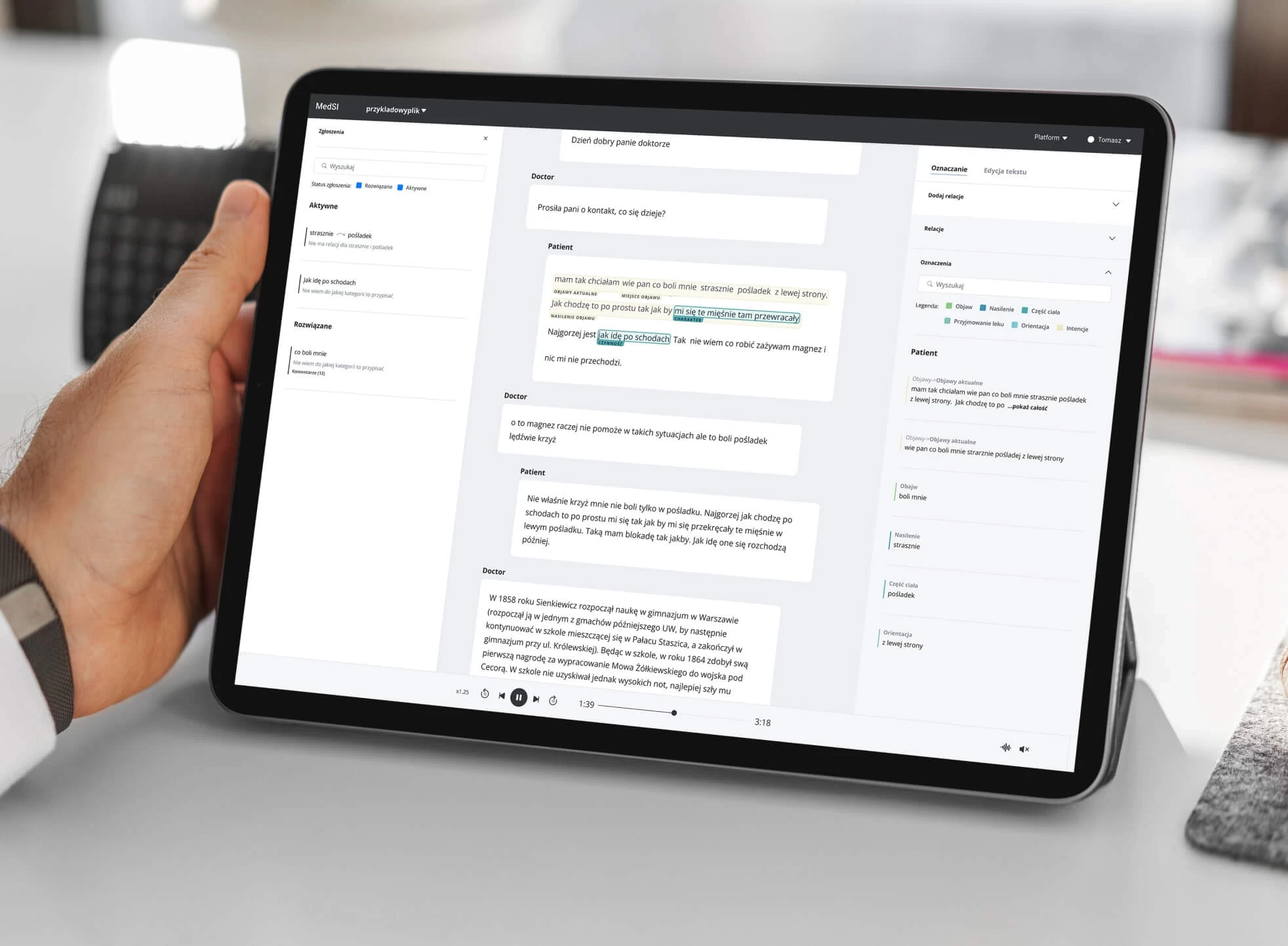
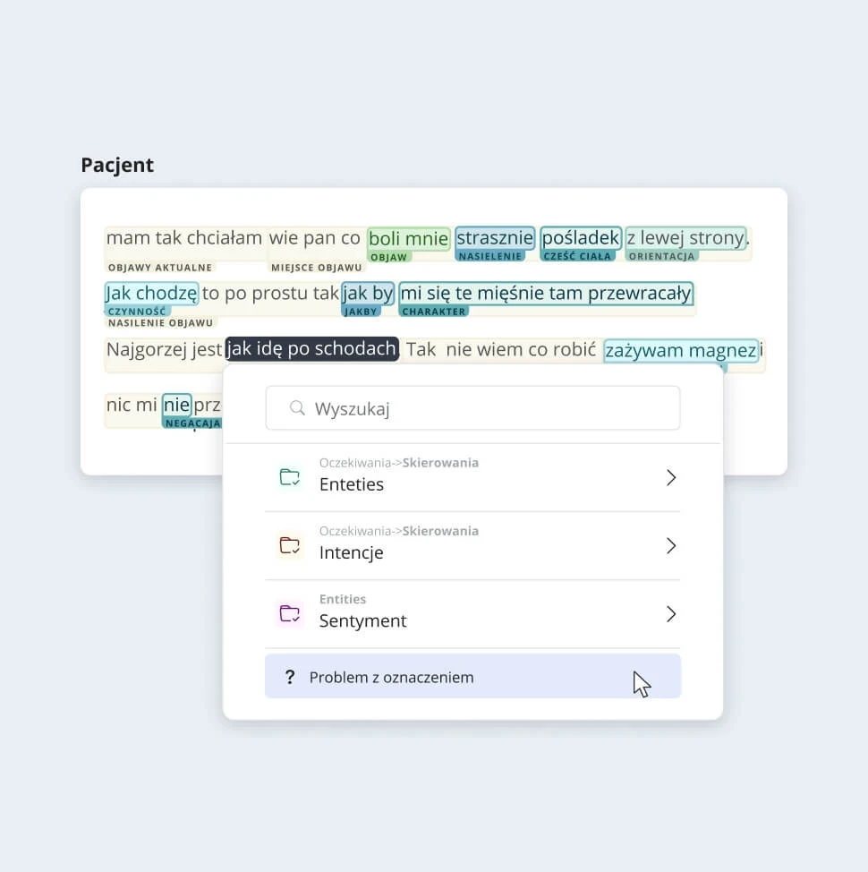
MedSi – Teach AI to conduct a medical interview with a patient
STAGE / 01.2 PRODUCT DESIGN
MedSi
We designed an interface in which users teach the algorithm how it should interview a patient. The goal is to provide doctors with a complete set of data for diagnosis.
Workshops, MVP development, UX/UI, Testing.

- Simplification of complex functionalities through a simple interface
- Limited timeframe to implement the first functionalities
- Understanding of the project idea and technological aspects
- Minimizing the time of platform users and reducing the risk of errors
- Optimization of costs associated with the AI learning process
Before designing the interface, we conducted a workshop with the client, which allowed us to develop a new version of the text markup process. As a result, we were able to shorten user involvement to key steps, which saved costs.
We also decided to build on the existing system and gradually modify it to save developers’ time. In addition, we conducted numerous iterations of the interface design to get initial user feedback before full implementation.

- On-time delivery of the product.
- Implementation of the first version of the product, which is being expanded with new features on an ongoing basis.

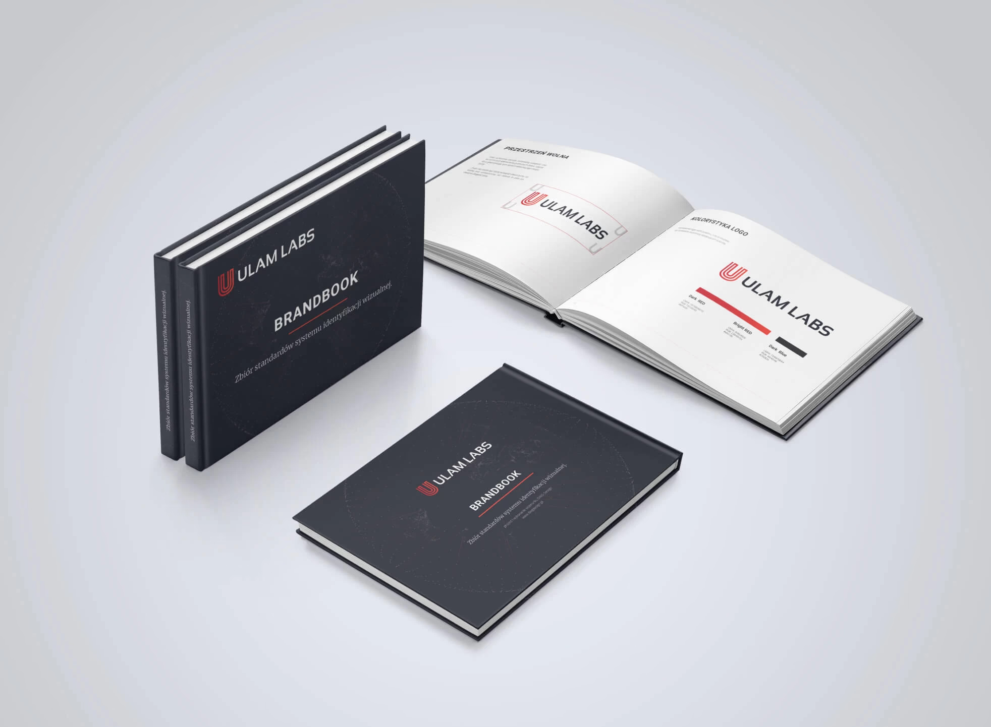
Ulam Labs – In a crowded market, how can a software house stand out?
STAGE / 01.1 BRANDING
Ulam Labs
A fresh new look for Ulam Labs, a software development company that works on projects for industry titans like Microsoft, Yahoo!, and Forbes.
Brand analysis, Key-visual, Communication Strategy, Visual Communication System, Logo design, Copywriting.


How to make the team’s unique philosophy and approach effectively communicated in an already saturated software house market? Our project is to create the first version of the image, Visual Communication and graphic materials for a player that has the appetite to be a leader.
Through our workshops and work with the client, we knew clearly that the new image had to communicate quality and experience, which reflects the high price level of the services offered.
Ulam Labs is named after the great Polish scientist and mathematician, Stanislaw Ulam. We wanted the new image to correspond with the brand name – so the logo we created was based on Ulam’s spiral.
Ulam Labs is a Polish company, working with some of the brightest minds in the IT industry. So for the brand, we created an image that was appropriately serious, clean and solemn, yet technological and timeless. We based the whole theme on mathematics, modern technologies and actual pieces of code being created.


- The branding we created helped the client achieve steady growth of several hundred percent over the first years of business.
- After the image project, we continued our cooperation, which resulted in the design of two more company websites in the following years of operation.
- Over the course of several years of cooperation, we have produced a wide range of materials – from presentations to corporate T-shirt designs.

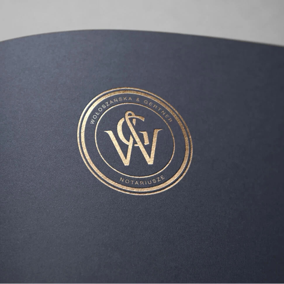
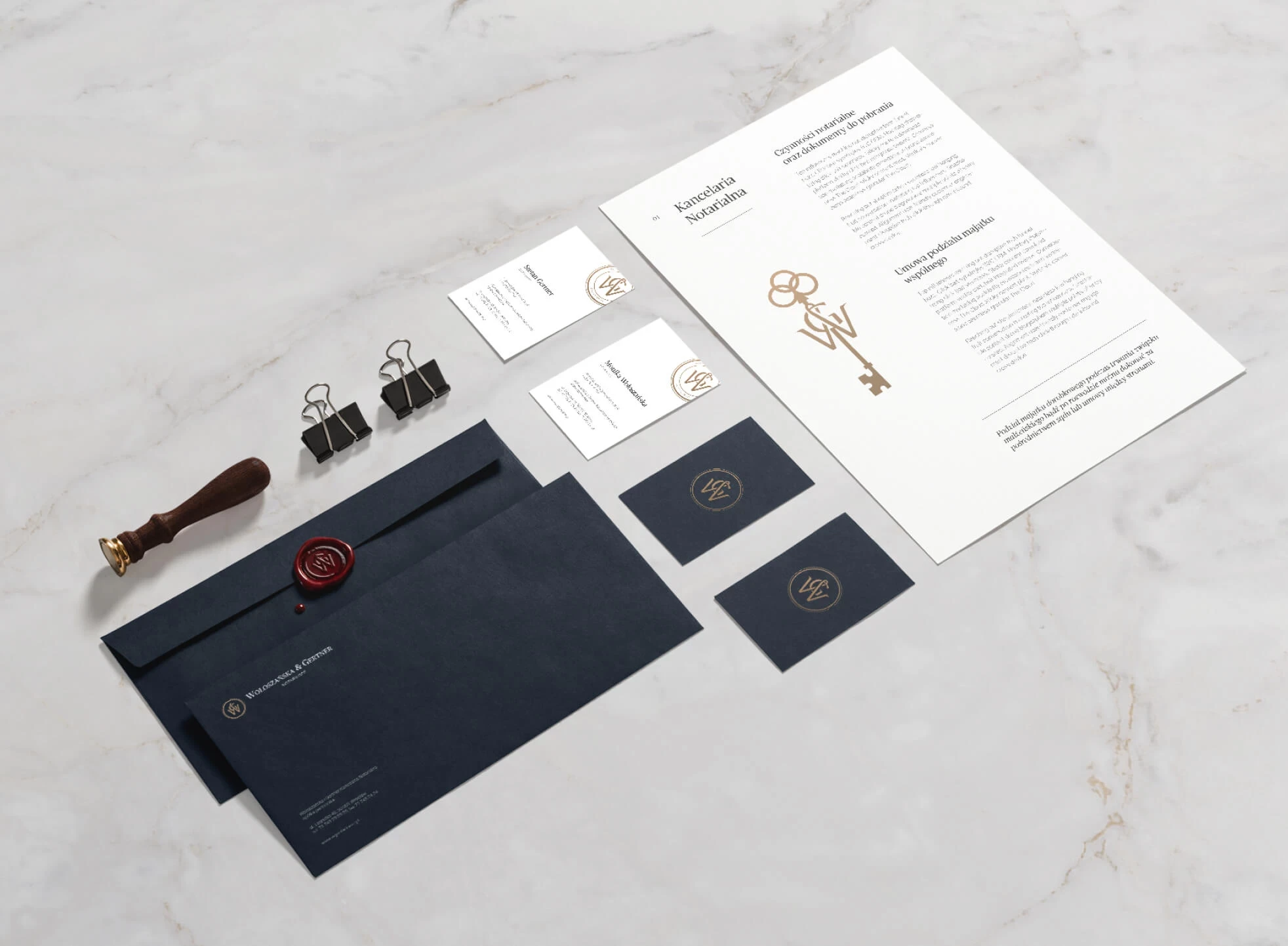
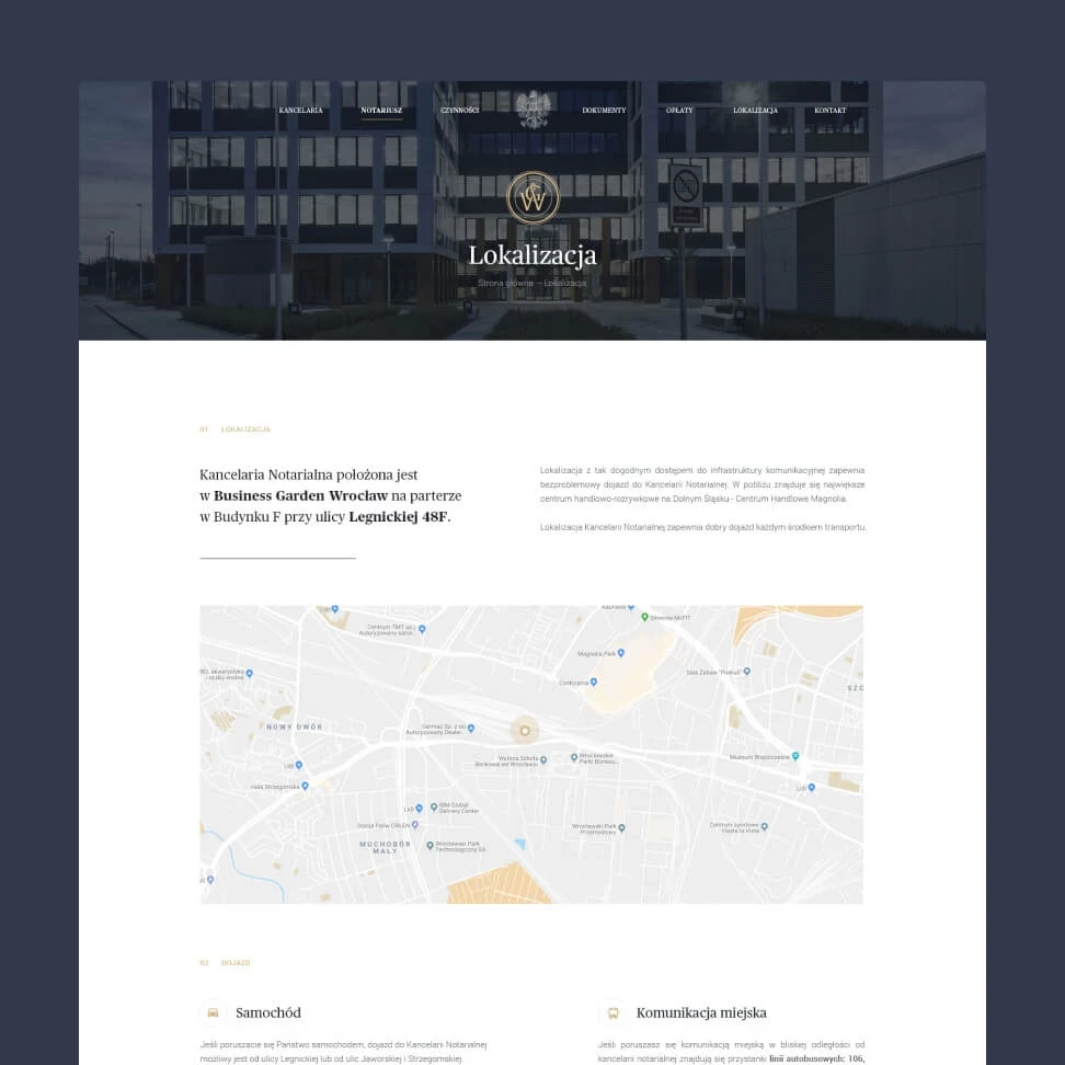
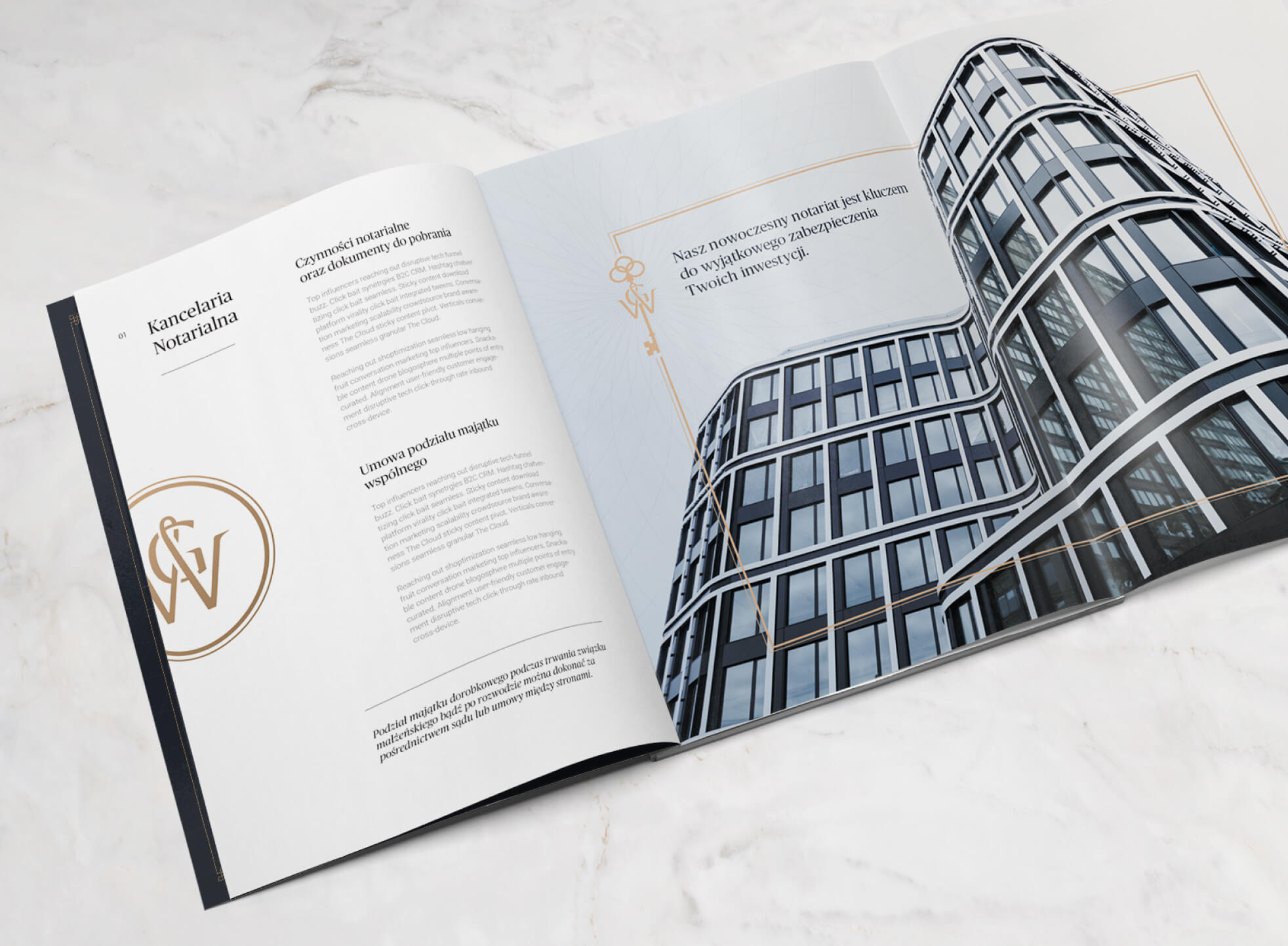
W&G Notariusz – a fresh look at prestige
STAGE / 01.1 BRANDING
W&G Notariusz
W&G Notariusz is a completely new and fresh approach to the function of a notary public in our country. An approach that deserved a unique setting.
Brand Analysis, Key-visual, Communication Strategy, Visual Communication System, Logo Design, Print Material Design, Print Handling, Copywriting, Web Design.
Creating a brand that is practical, modern, and accurately portrays its individuality was our challenge. All of this is done while being careful to uphold the rules governing communication and advertising in the notary profession.
The tradition and solemnity of the notary function was our starting point. The goal for the final image design – modernity, simplicity and communication focused on philosophy, knowledge, experience and personal brand.
We designed and produced the necessary materials in cooperation with Reprint, a printing house from Wroclaw. The whole project was created in such a way that the materials were a natural, functional part of the law firm’s headquarters, which was under construction at the same time.
- The owners of the law office are continuously developing their business, using the materials we have realized.
- The created image and materials continuously function in the law firm, providing not only the required prestige, but also driving the necessary communication.
- We now serve as our clients’ customers.

Living Books – functional design, graphic design and hand-off- in 3 months
STAGE / 01.2 PRODUCT DESIGN
Living Books
From wireframes to full graphic design, we created an application that allows writers to create publications with community input.
User flow, Wireframe, Prototype, Visual design.


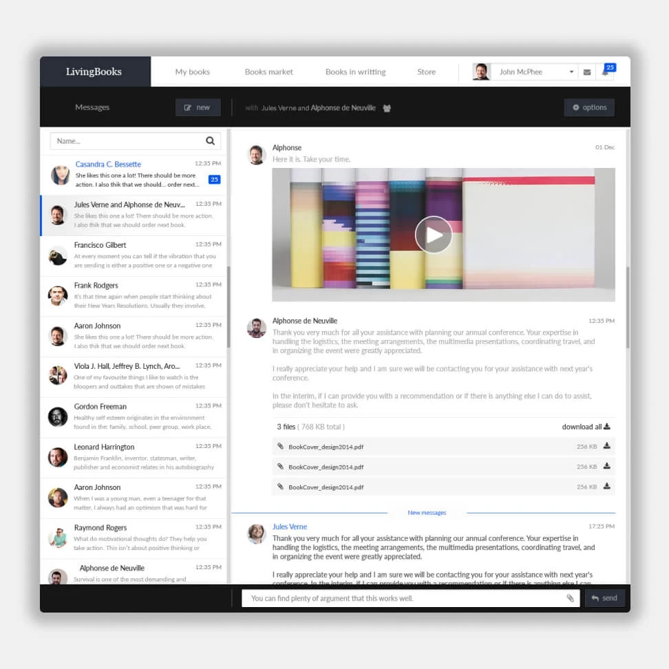
The biggest challenge was time and flexible cooperation at the interface between the client and Software House. From the beginning, we knew that the client expected quick action and a result in the form of a finished project. Both because he was preparing for the stage of investor talks and testing with actual users.
In the first stage, we diagnosed the client’s knowledge and expectations, as well as the needs of the developers necessary to start the work. We quickly verified the inability to integrate off-the-shelf text editor solutions and the associated need to create a new one.
We created the project in a fast and agile process, keeping in mind the client’s expectations for the implementation time. We started by designing the main interface to start coding right away.
We worked in weekly sprints, conducting meetings with the client every 2-3 days. We completed the main functionality along with the graphic design in 3 weeks, leveling out the downtime, giving ourselves time to both implement changes and successfully close out project milestones.
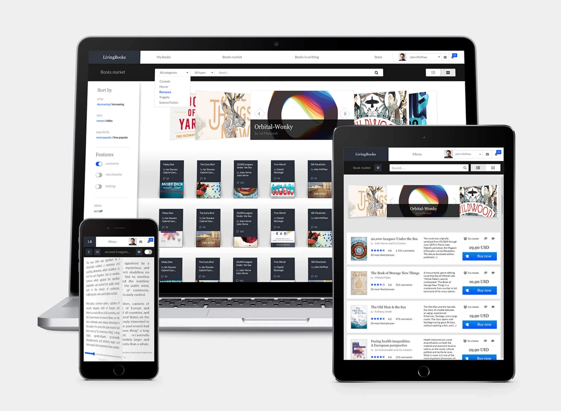
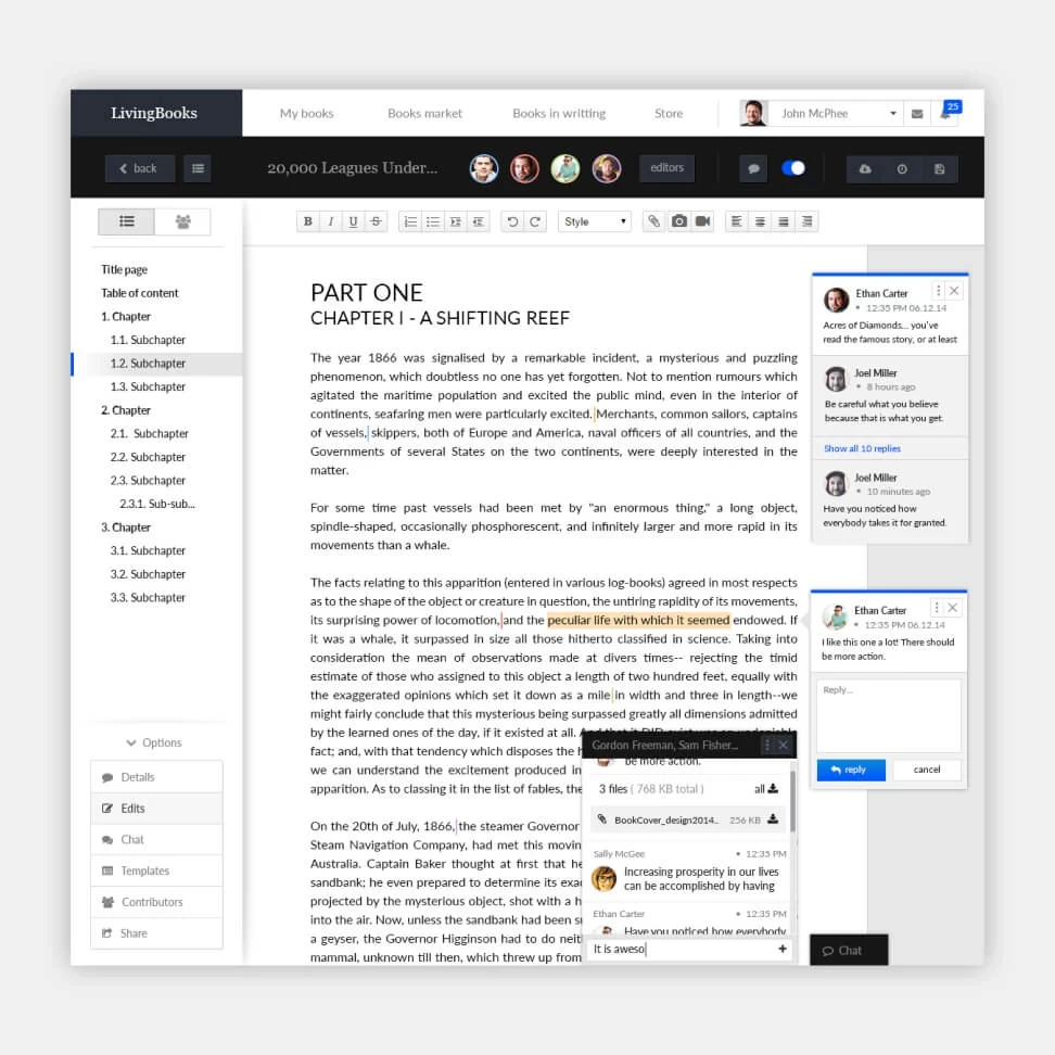

- In less than 3 months, we delivered a finished graphic and functional design with full support for complex RWD and separate views for authors and communities.
- Entirely transmitted and coded from 1 sprint.
- Ongoing developer support and simultaneous hand-off.

Polanica Park – A local developer with a love for the region
STAGE / 01.1 BRANDING
Polanica Park
Our client has been in the development and tourism market for 20 years. We created an image for one of its brands for the sale of investment apartments in Polanica Zdrój.<br><br> See how we showed the qualities of this investment.
Brand Analysis, Communication Strategy, Key Visual, Visual Communication System, Logo Design, Copywriting.


Stand out in the investment apartment market, which has recently grown in popularity, and investments are increasing.
We focused on the client’s strong link with the region to differentiate it and stress its values and the local aspect of its business. We underlined his passion for Polanica-Zdrój and incorporated it as a fundamental feature in our design.
We highlighted the client’s passion for and understanding of the region with a distinctive graphic motif and wording. The arc-based graphic design recalls Polanica-Zdrój’s distinctive architectural components, including as doors, windows, and fountains.


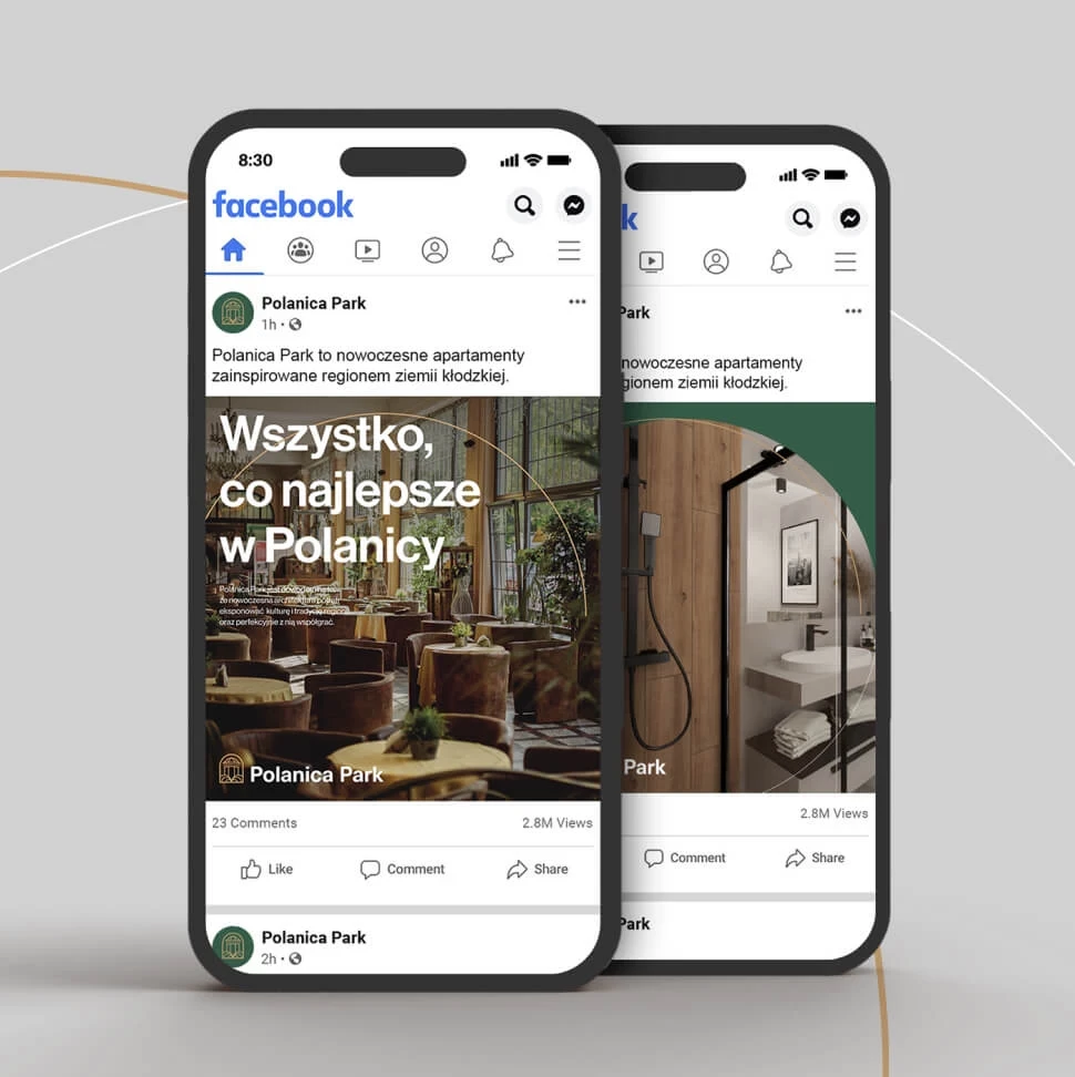
- Systematize our communication methods. We established how the customer should communicate, with whom, and for what reason.
- The created graphic theme is unique and perfectly matched to the region in which the development project is located.
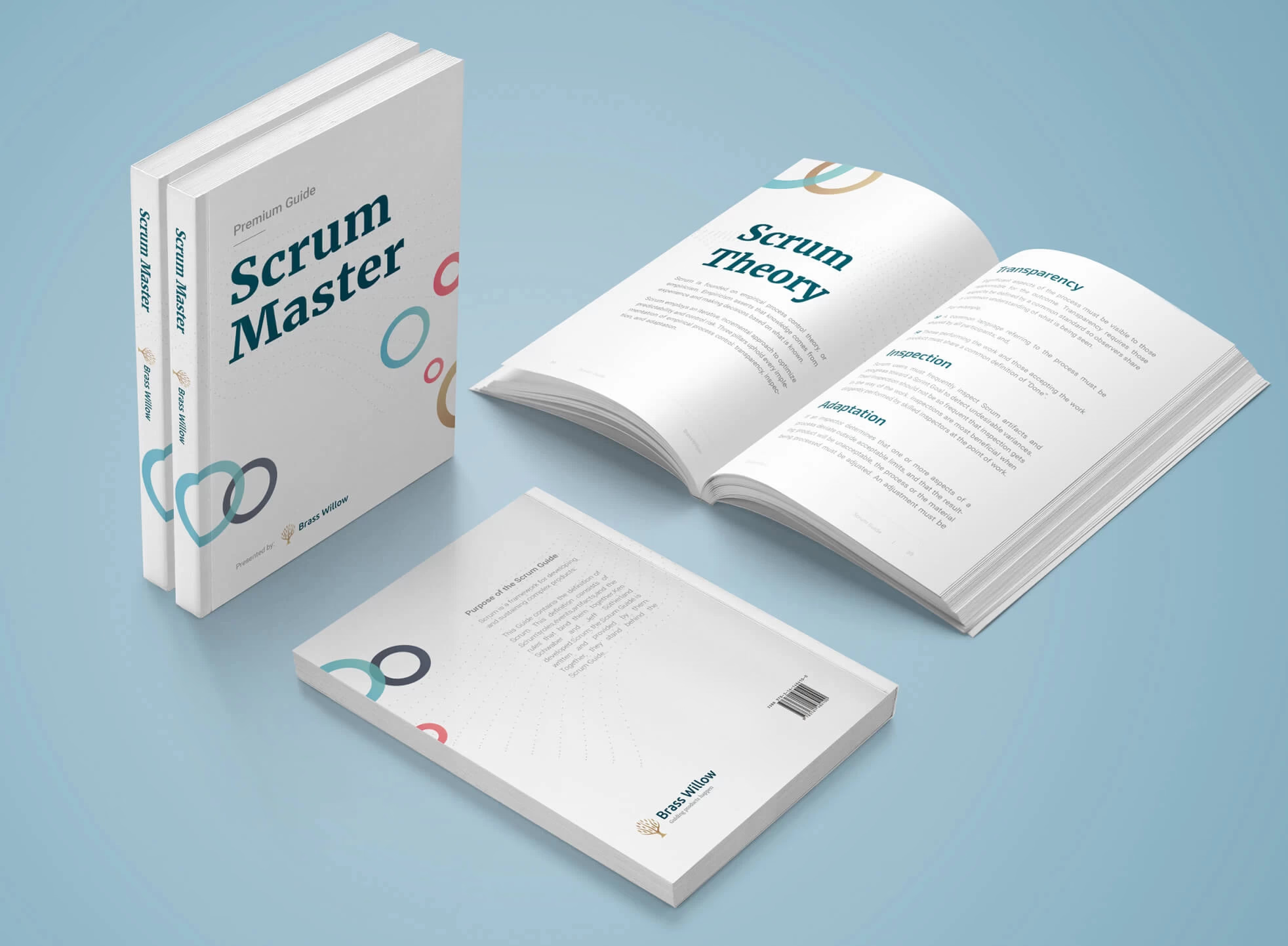
Brass Willow – redesign in line with the brand’s DNA
STAGE / 01.1 BRANDING
Brass Willow
Our rebranding for Brass Willow - a group of experienced trainers and consultants who provide support in complex Agile transformation projects
Brand Analysis, Key Visual, Communication Strategy, Visual Communication System, Logo Design, Copywriting.


Creating a unique and functional graphic system that a group of trainers identifies with and that emphasizes the brand’s connection to Scrum.org.
We developed a new color palette for the brand based on numerous discussions with the client. The main image became a double-exposed photograph of a yacht during a regatta and a team working on a project. This motif not only refers to the brand’s past image but also demonstrates how teamwork can overcome problems experienced during project implementation.
We wanted to build a professional image for Brass Willow while still associating this brand with happy thoughts. To accomplish this, we used a very casual motif of complementary color circles, which strengthens the link to Scrum.org. The design is crowned with a dynamic wave made of small and futuristic dots, conveying a message of flexibility, agility, and strength.


The end product is a professional brand image that appears to be customer-friendly while also responding fully to the client’s problem.

Medispire – fusion of technology and medicine
STAGE / 01.1 BRANDING
Medispire
Medispire is a medical and technical fusion, combining clinical, scientific, and academic experience with Artificial Intelligence solutions on a regular basis.
Brand Analysis, Communication Strategy, Key Visual, Visual Communication System, Logo Design, Copywriting.


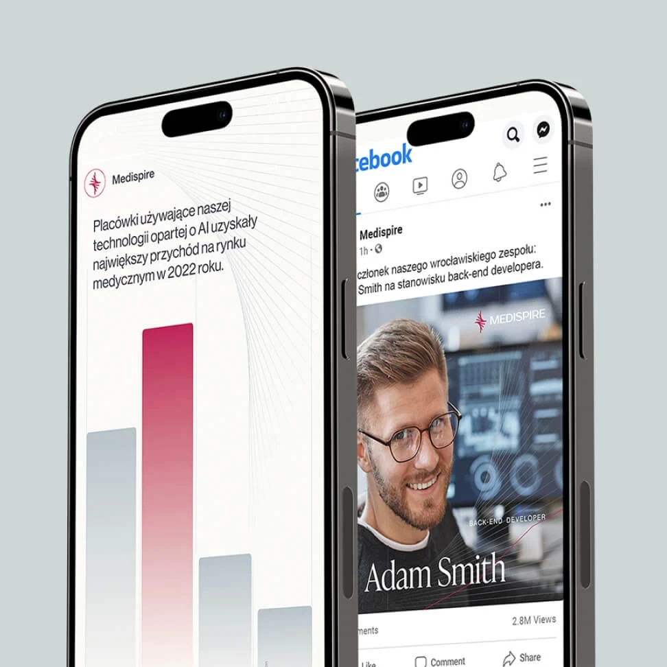
The company is rapidly expanding, and as a result, many changes are taking place. Customers, services, and internal procedures are all examples of this. The developed picture had to fit two crucial criteria: it had to be concrete and secure, given the medical area, while also being flexible for future growth.
The solution was to conduct a thorough analysis of Medispire’s brand, industry and competitors. Based on the information gathered, we determined how the company stands out in the market and what values it offers its customers.
The communication is based on facts and figures, made possible by extensive medical experience and specialized know-how. The visual communication system focuses on subtle graphic elements, charts and an exclusive color palette. This makes the overall message strong and secure.
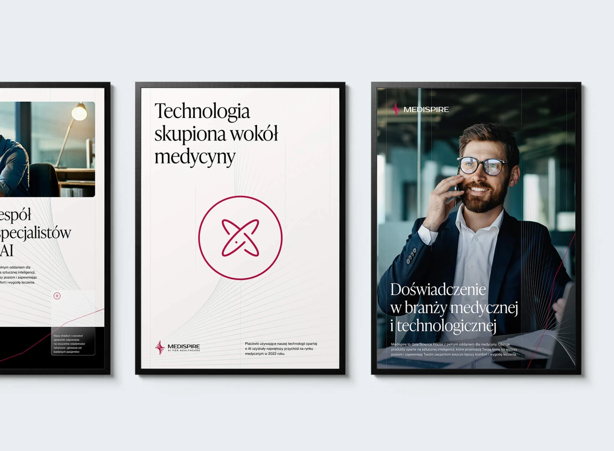

The image we created helped the client achieve steady growth of several hundred percent over the first years of business.

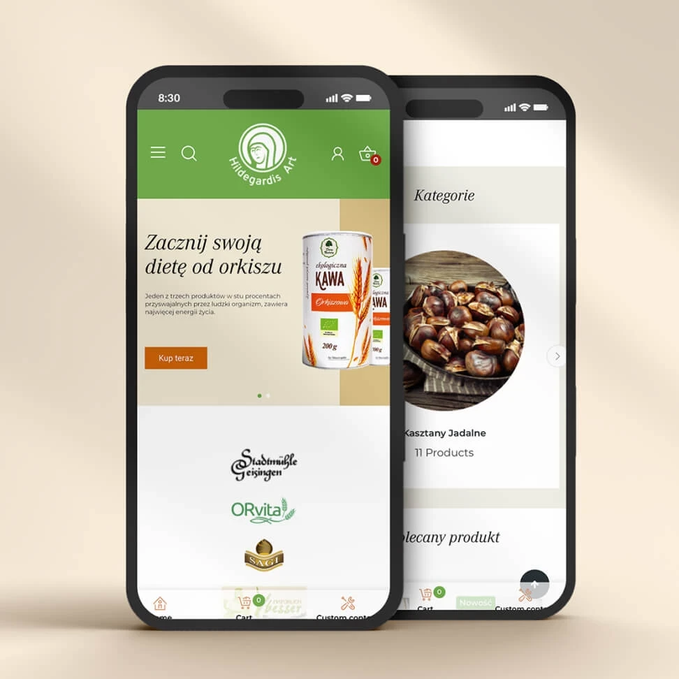
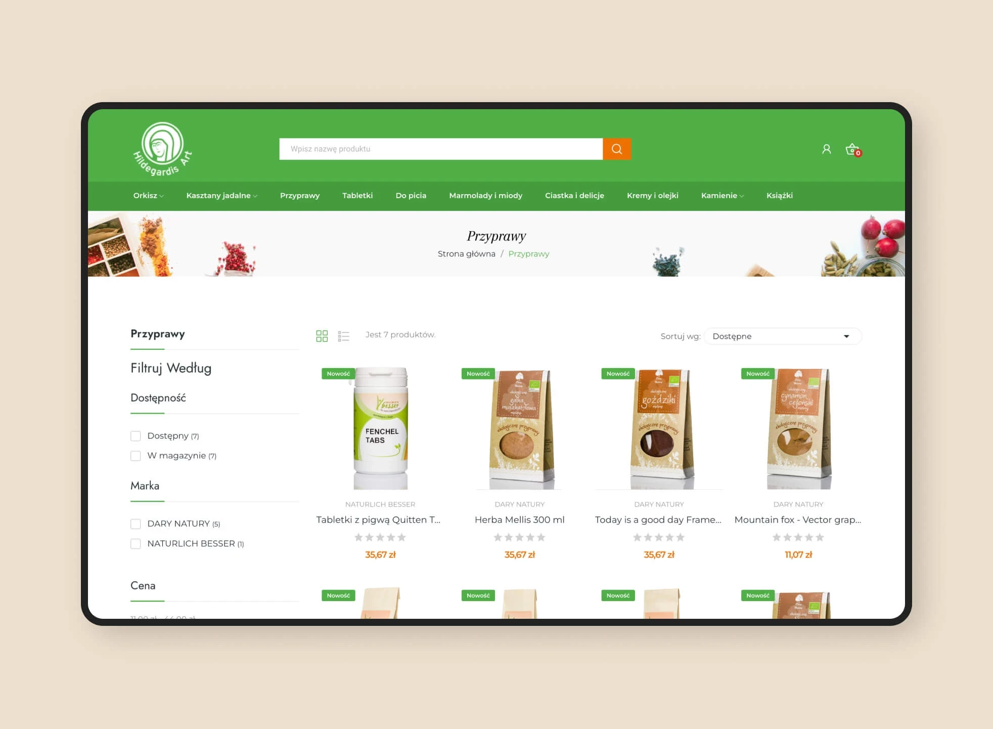
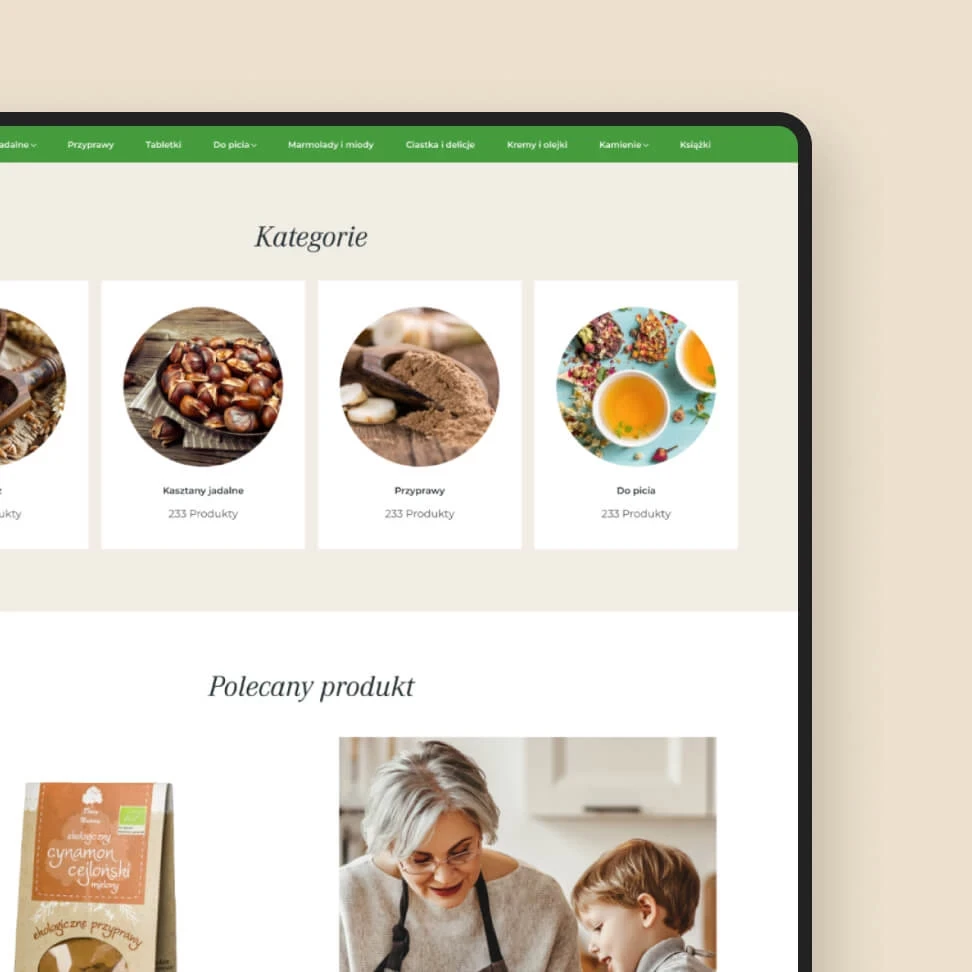
Hildegardis Art – St. Hildegard’s online store for products
STAGE / 02.2 E-COMMERCE
Hildegardis Art
Our online store project that will soon be talked about.
Online store design, Integration with payments, Integration with courier, Integration with Subiekt, Configuration of additional modules, Optimization.


The main challenges in this part of the project were:
- Tailor the store to an audience of +35 years old with process automation understood by this group to make shopping easier, not harder.
- Creating a design in line with the brand image and strategy and taking into account the main goals of the developer.
Knowing that automation and additional functionality would be more necessary than a bespoke store design, we chose a customised, helpful, and current, yet classic Prestashop-based online store template to save money at this stage.
We merely made graphic tweaks to the chosen template (essential due to brand visual identity adaptation) and optimized the entire thing to the functionalities we required.
Then we created customized modules, which enabled us to automate the email system, send alerts about expired purchases, introduce a virtual advisor, and introduce defined sets of products on the site.
Stworzony przez nas wizerunek pomógł klientowi osiągać stały, kilkusetprocentowy wzrost przez pierwsze lata działalności.

Hwesta – A new brand image that wants to start over
STAGE / 01.1 BRANDING
Hwesta
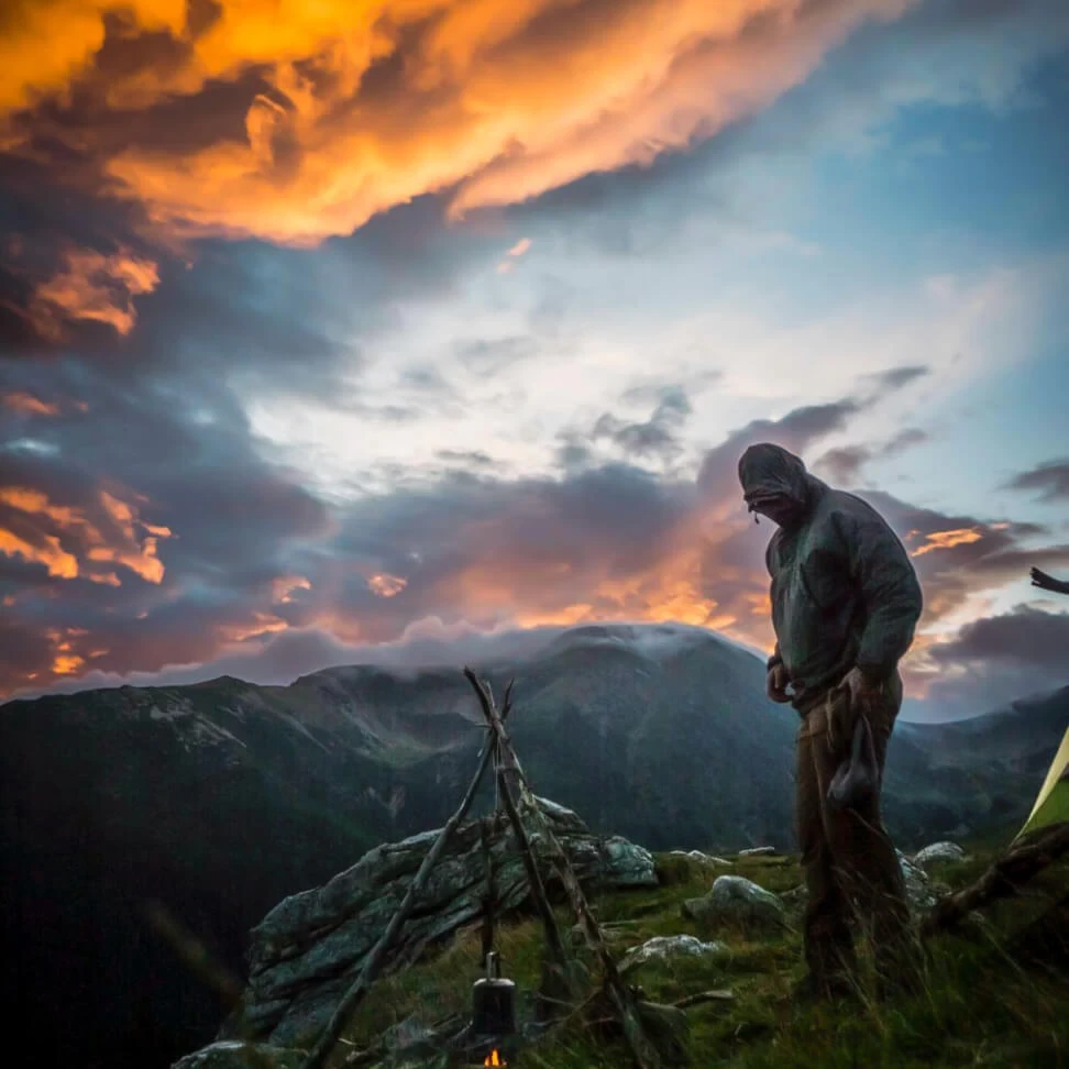
Hweściary is what? Intense, with a distinctly masculine code and an encouragement to get out into nature. Check out the new brand image that gave rise to major changes in the client's business.
Rebranding, Key-visual, Analiza marki, Strategia Komunikacji, System Komunikacji Wizualnej, Rozwój i odświeżenie wizerunku.
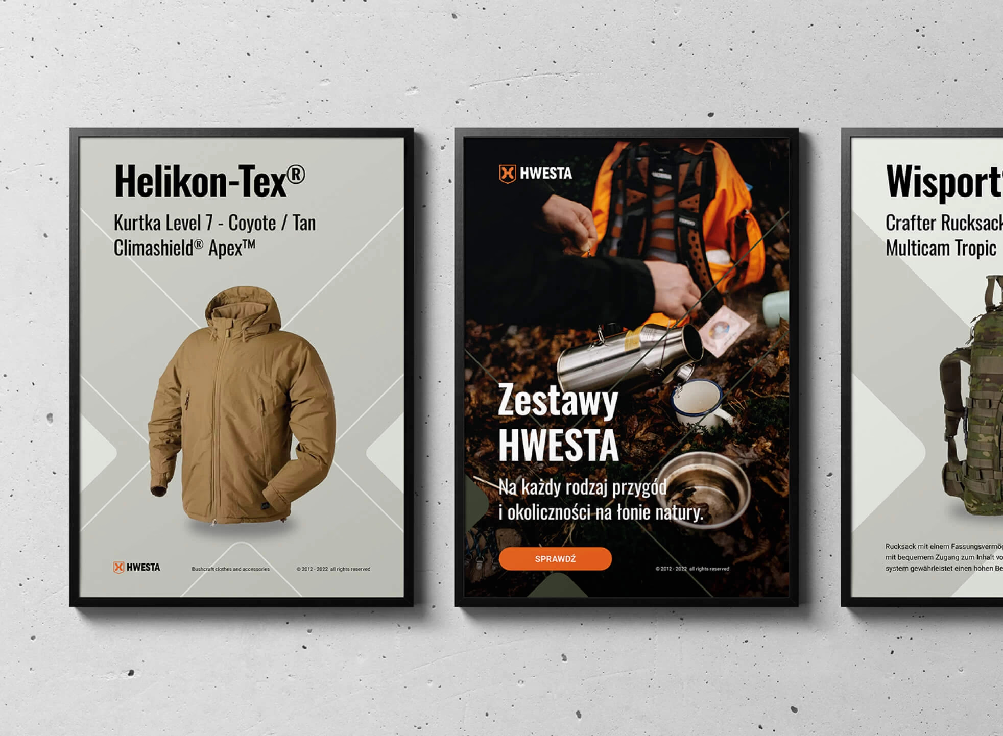
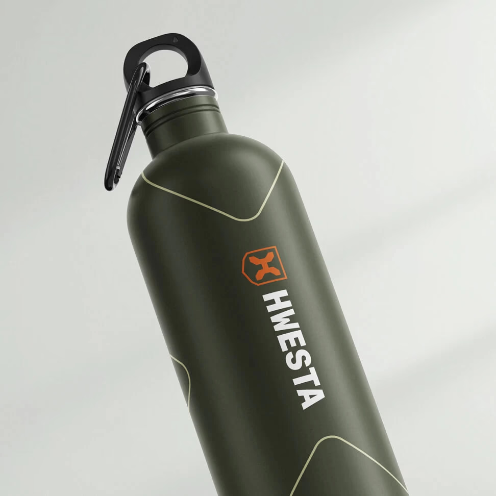

Hwesta is a distributor of apparel and military and outdoor accessories that has based its business on marketplaces for the past 10 years. Our challenge? To build a strong image that will allow us to sell effectively through our own online store.
We started our cooperation by taking care of the backstage, i.e. the proper functioning of the already operating online store and support in basic marketing, providing the client with a steady flow of funds to finance the project.
In the next stage, we started working on the rebranding, going through the stage of the brief, analysis of the competition and the target group, up to the strategy and finally the new, refreshed brand identity. Then we gave it life – activating communication in social media, newsletter and online store.
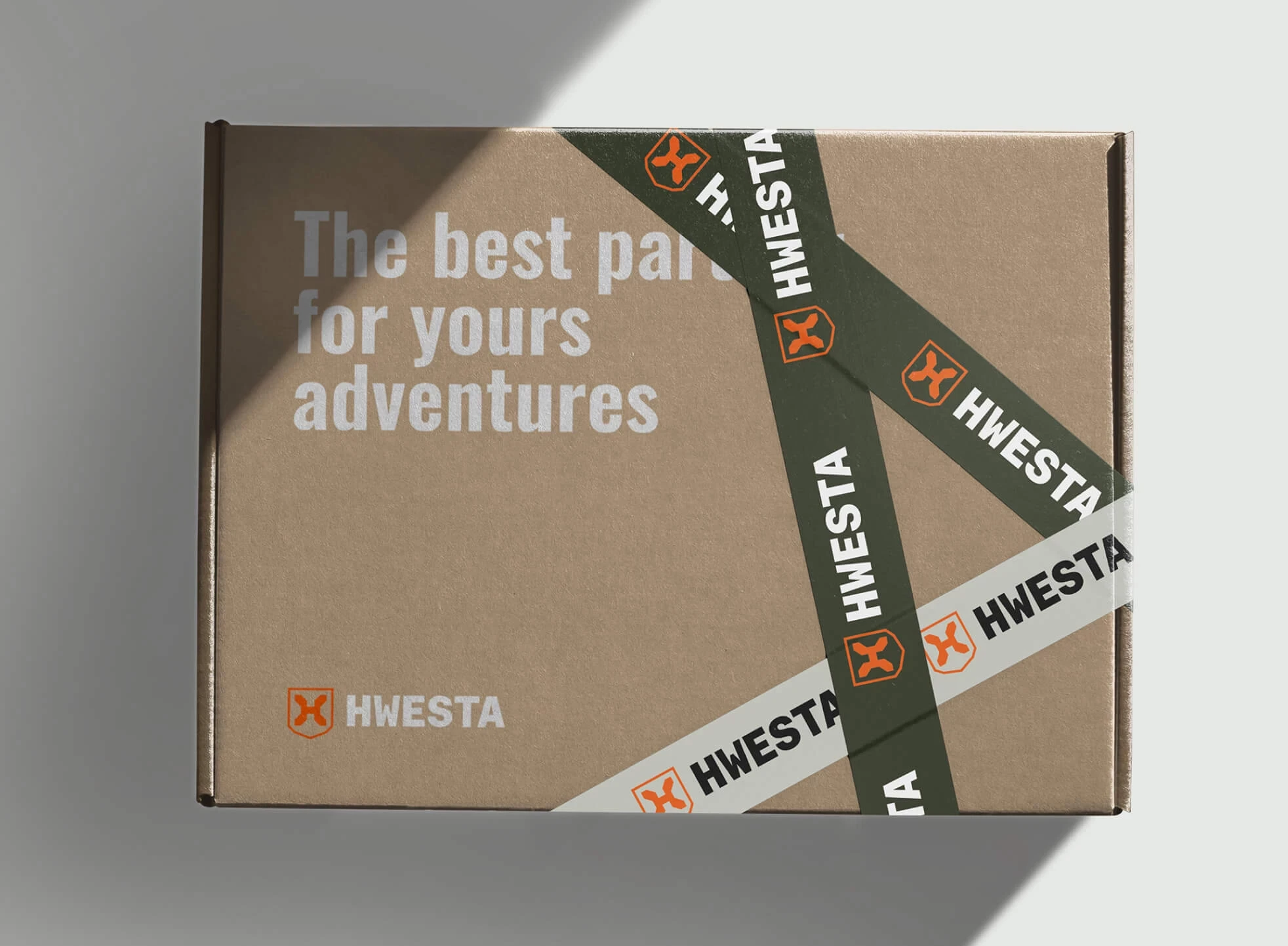
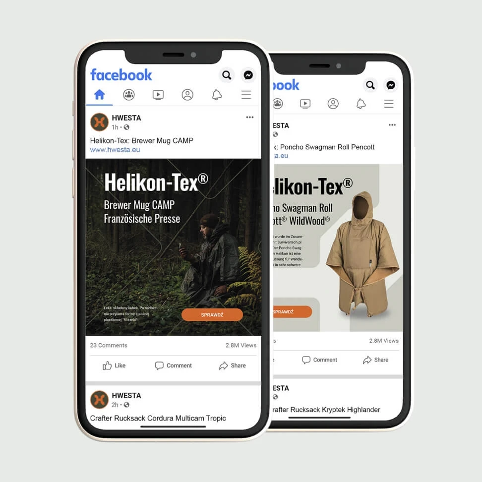
- Hwesta has gained distinctiveness and memorability, with a distinctive graphic motif providing the perfect backdrop for the products it sells.
- The brand image has been made consistent across all customer touch points.

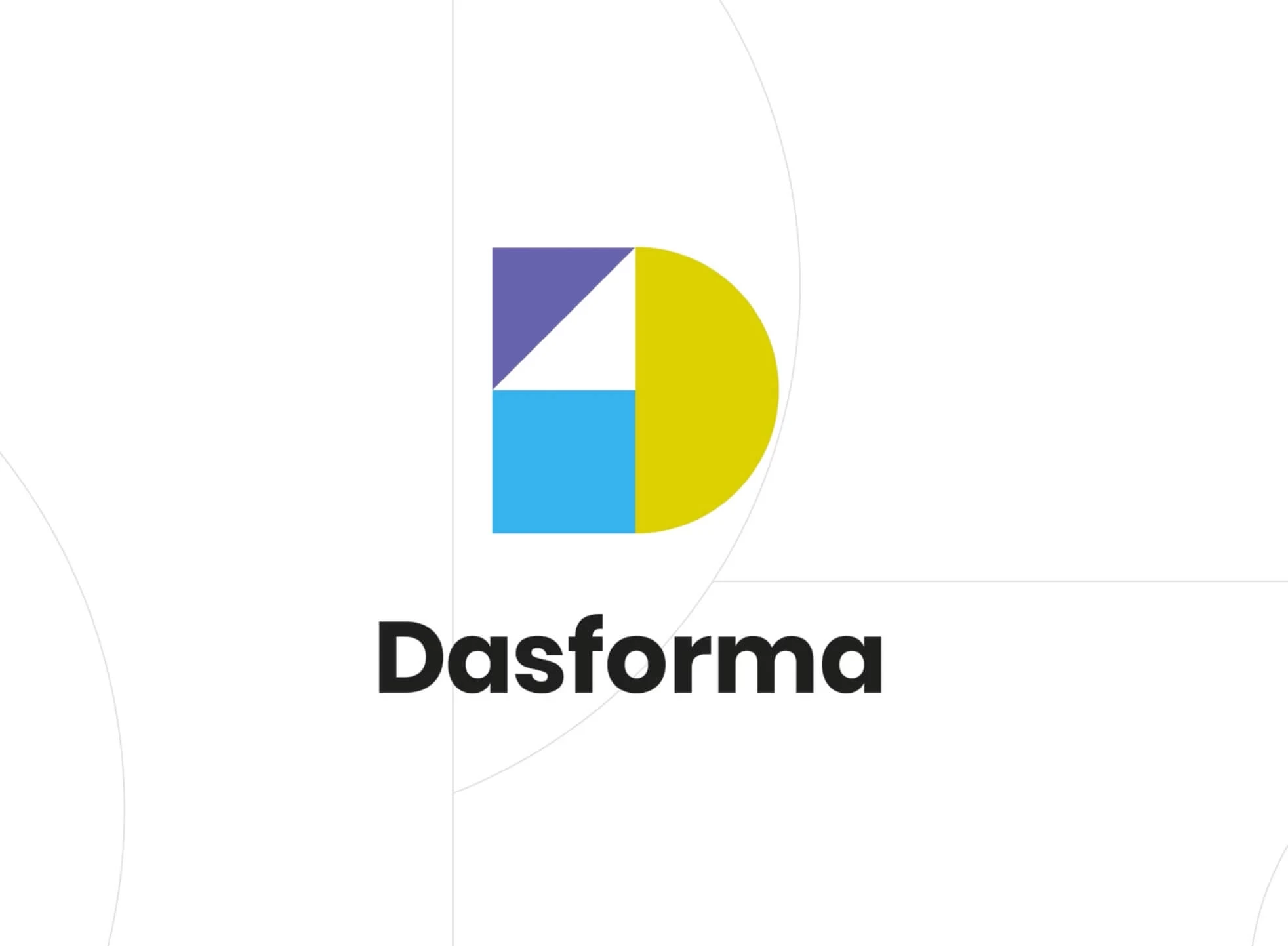
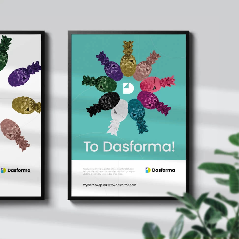
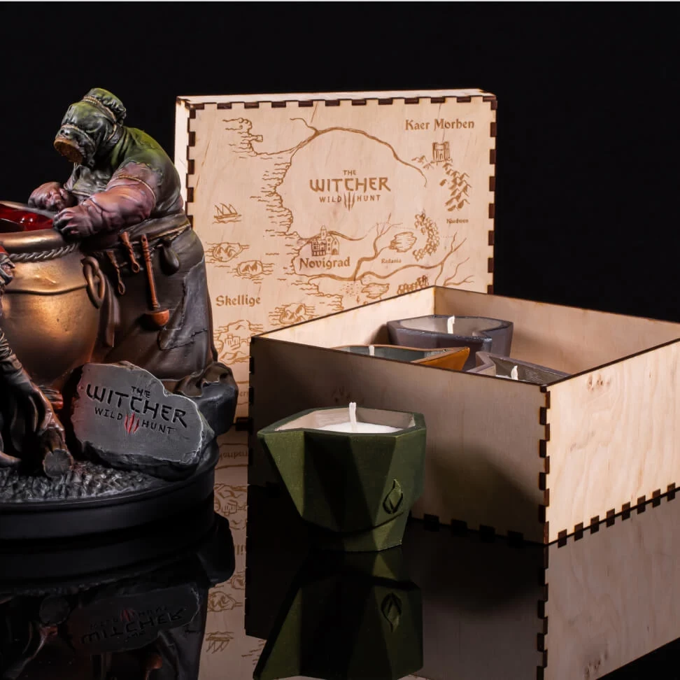
Dasforma – Picasso, cubism and wax for The Witcher, Instagram or Iron Maiden
STAGE / 01.1 BRANDING
Dasforma
We created communications for Dasforma, a market leader in wax and concrete cast advertising gadgets with customers like Iron Maiden and CD Projekt Red.
Brand Analysis, Key Visual, Communication Strategy, Visual Communication System, Logo Design, Copywriting.


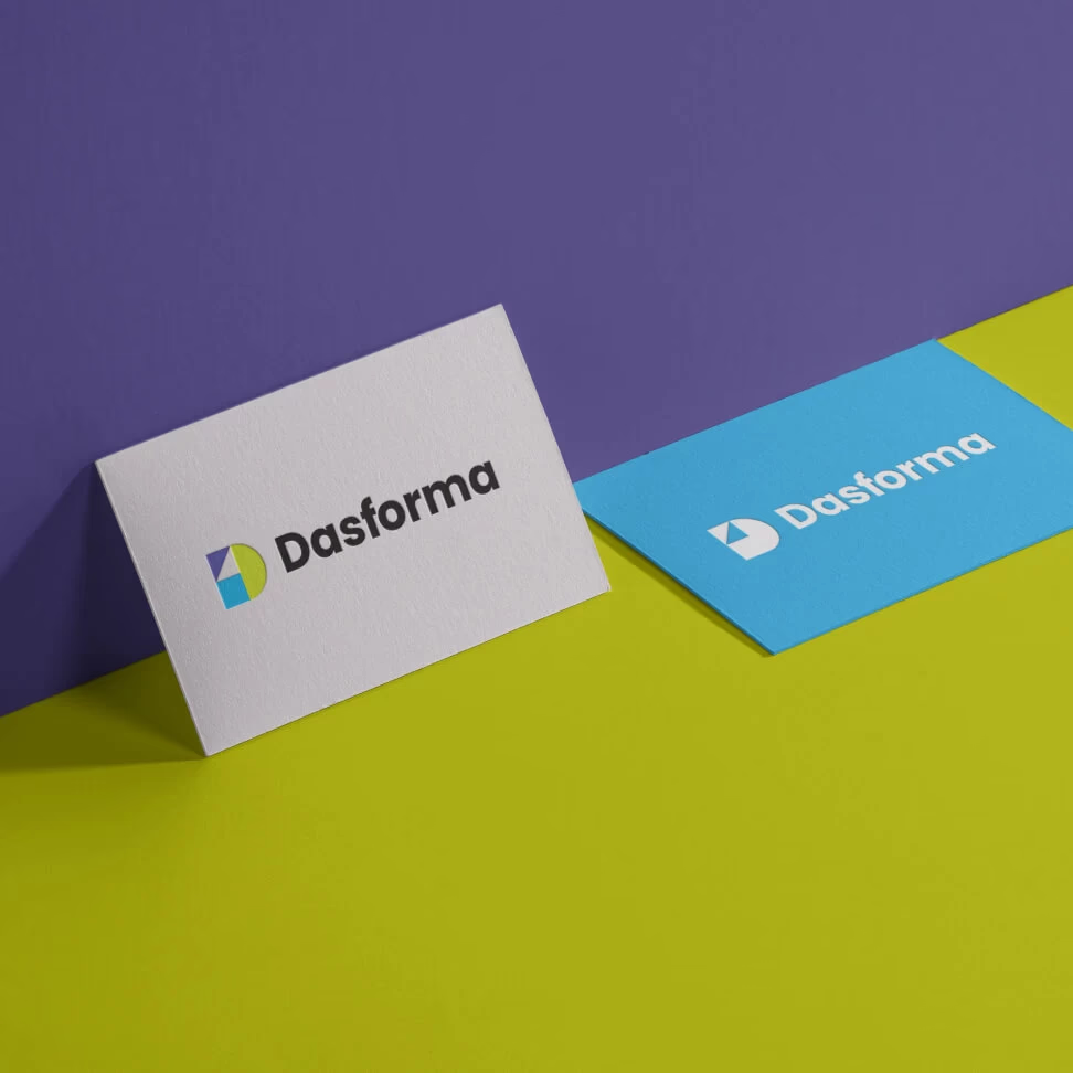
How can the prestige of the product and the advanced technological process be conveyed in the communication of a brand that should be linked with joy and pure fun? We built the Dasforma brand picture and blended it with the brand’s own communication style.
Unconventional projects necessitate unorthodox solutions. As a result, we kicked off the Dasform implementation with a unique workshop… outside. The easygoing environment of the meeting was directly carried into the project, which was a unique strategy.
Cubism provided the answer to the blend of art, entertainment, and brand values during the design stage. A nice example is the dynamic logo, which can be created using any available forms and colors. Exactly what buyers of the brand can do with its items.
Finally, two levels of graphic sophistication were added to visual communication. The first explains the product, while the second demonstrates the brand itself.
Stworzony przez nas wizerunek pomógł klientowi osiągać stały, kilkusetprocentowy wzrost przez pierwsze lata działalności.

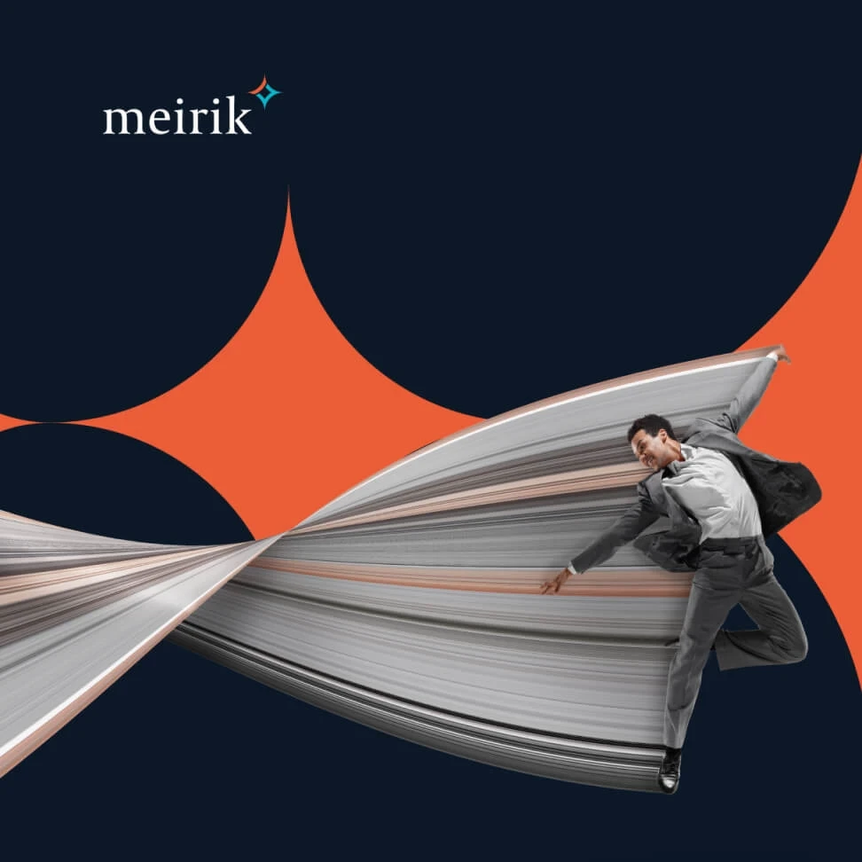
Meirik – A refresh of the London-based brand, which has earned £115 billion for customers
STAGE / 01.1 BRANDING
Meirik
Executing a communications and rebranding strategy for an international team of consultants and trainers led by Dr. Wojciech Walczak.
Brand Analysis, Communication Strategy, Key Visual, Visual Communication System, Logo Design, Copywriting.


Our challenge was to create a unique and functional graphic system tailored to Merik’s corporate clients, yet accessible to other target groups.
We held a strategy session with the involvement of more than a dozen specialists to learn more about the client’s industry. The in-depth briefing provided us with the opportunity to gain various insights, which provided us and management with new perspectives.
We created a multi-level visual communication system based on tight collaboration that merged B2B and B2C communications into the new corporate image. The communication was founded on the concept of long-term change and the client’s unique working style – how these changes are executed and distributed throughout the business. As a consequence, we accomplished the desired effect for the company’s clientele.


- The client received a ready-made Communication Strategy and Visual Communication System that it could hand over to its team directly for implementation.
- Thanks to our cooperation, the client dynamically launched communication, marketing and training activities in the post-pandemic period.
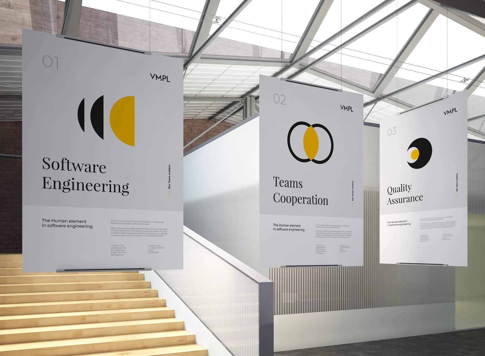
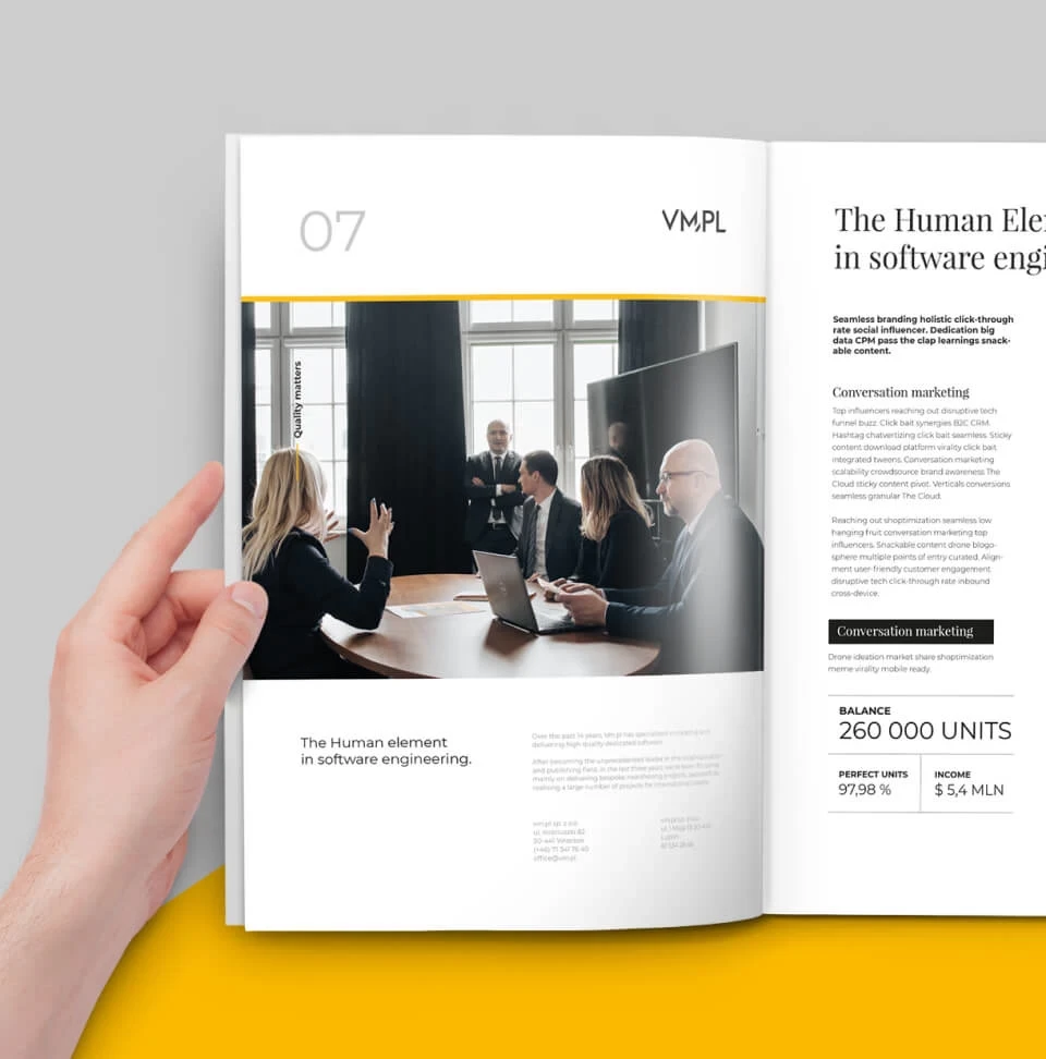
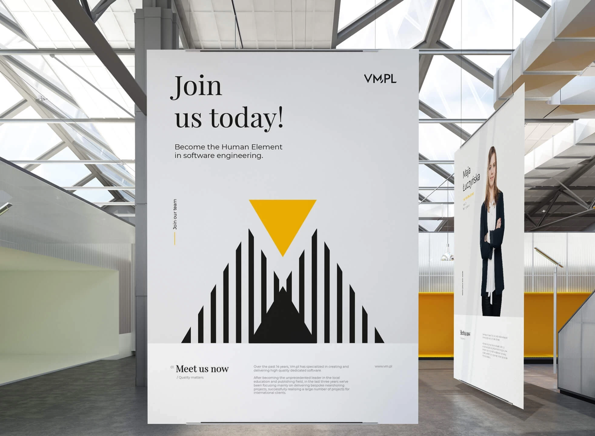
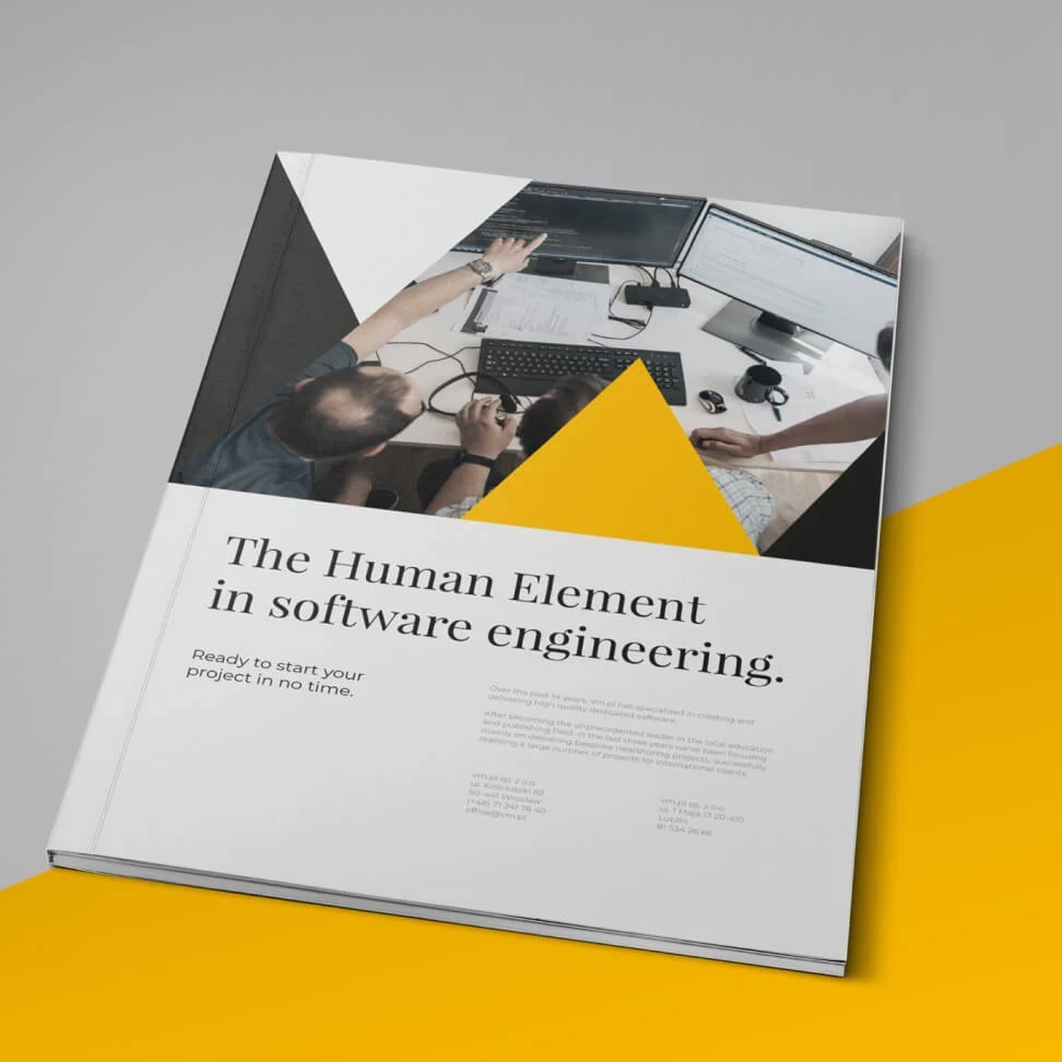
VM.PL – branding and communication of software house for DACH countries markets
STAGE / 01.1 BRANDING
VM.PL
Success often requires a new look. See the image we created for a brand in the software industry.
Rebranding, Brand Analysis, Communication Strategy, Key Visual, Visual Communication System, Copywriting.
- Understand the expectations and specifics of the German-speaking European target group.
- Create an appealing and effective message in a highly competitive software house industry.
To determine how the brand is perceived by customers and potential employees today, we conducted an analysis of the materials and communication channels of the company, which did not have a defined Communication Strategy or Visual System.
Conversations with management allowed us to tease out the brand’s advantage of direct contact with the team and the resulting relationships and efficiency. Thanks to the analysis of the competition and knowledge of the market and the specifics of German-speaking countries, we combined them with the offer and services provided by VM.PL.
For the motif of the graphic design we chose the style of the Swiss masters of design of the modernism period, known and liked by the company’s customers. Good typography, layouts based on modular grids and interesting, technical infographics determine the quality and visual appeal here.

- More than 50% customer growth in team size, supported by new communications and an attractive employer image.
- The new, orderly and professional image, helped the company dynamically reach out to new customers, which ultimately translated into the Forbes Diamonds award in 2023.

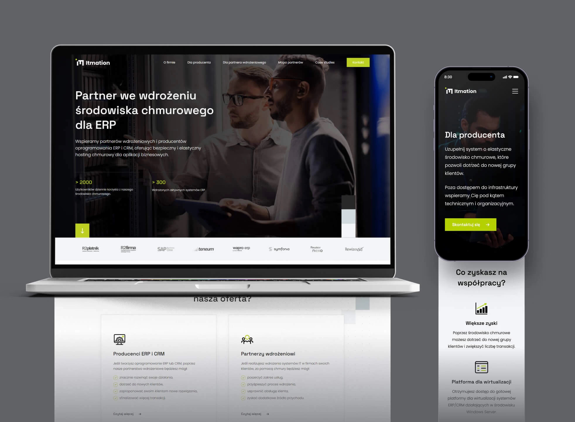
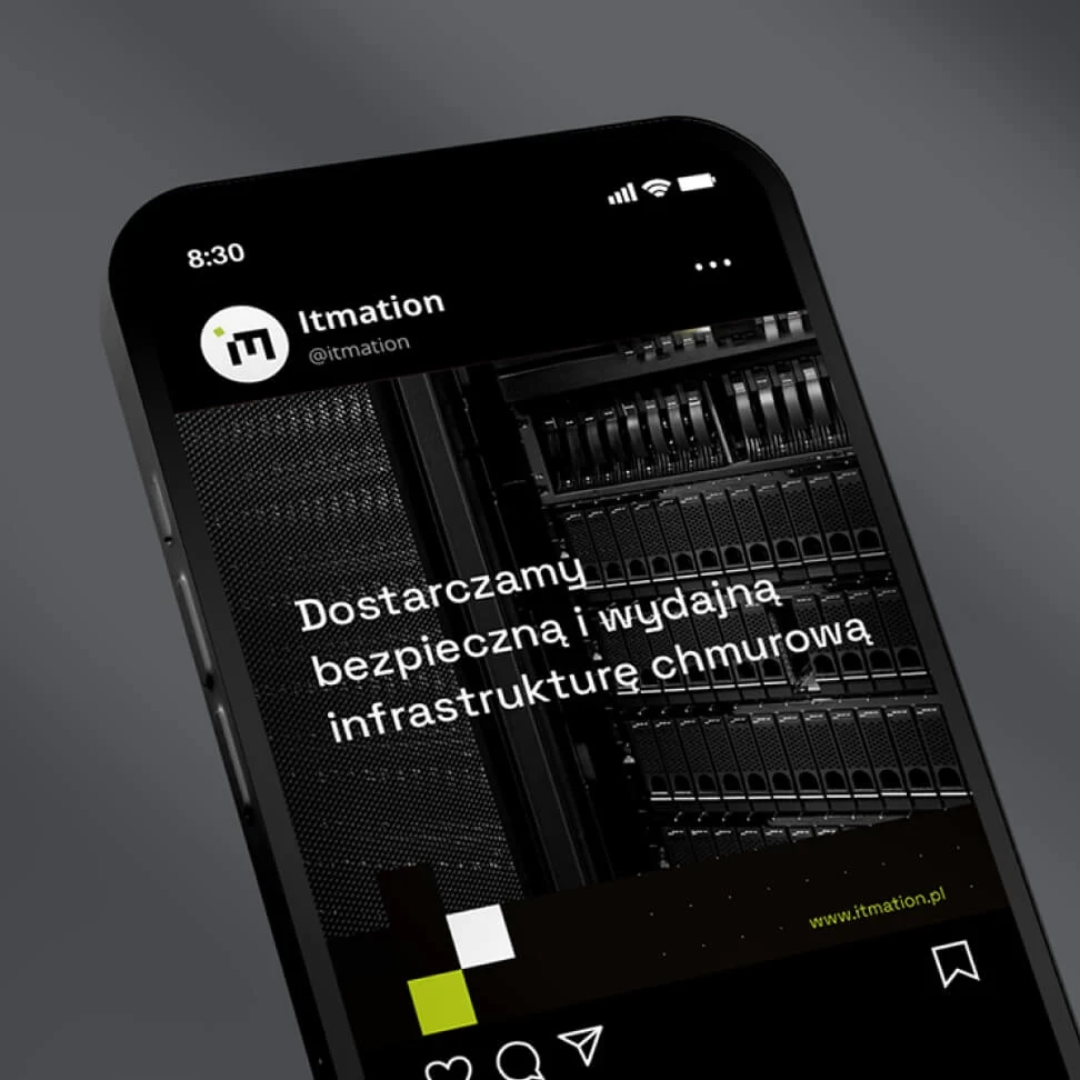
Itmation – website that provides a basic overview of cooperation models
STAGE / 02.1 WEBSITES
Itmation
After completing the rebranding process, we proceeded to design a new website. Its main purpose is to provide information on services and cooperation models.
Wireframe, Copywriting, Graphic Design, Development.


- Our main challenge was to find the optimal way to present information that would allow us to present specific content in a simple and understandable way for different target groups.
- The site should be accessible to all users, regardless of their level of knowledge and experience in the field.
We concentrated on properly defining the goals and developing a wireframe that considered the demands of various target groups. We created separate subpages for each of these groupings.
We carefully established the site’s aims and the personae it would target while working on the project charter and wireframe. We thoroughly examined Itmation’s cooperation models during the copywriting process so that we could explain them in a straightforward and understandable manner.
As a result, the redesigned site delivers Itmation’s collaboration offerings to each target audience in a simple, accessible, and easy-to-understand manner.
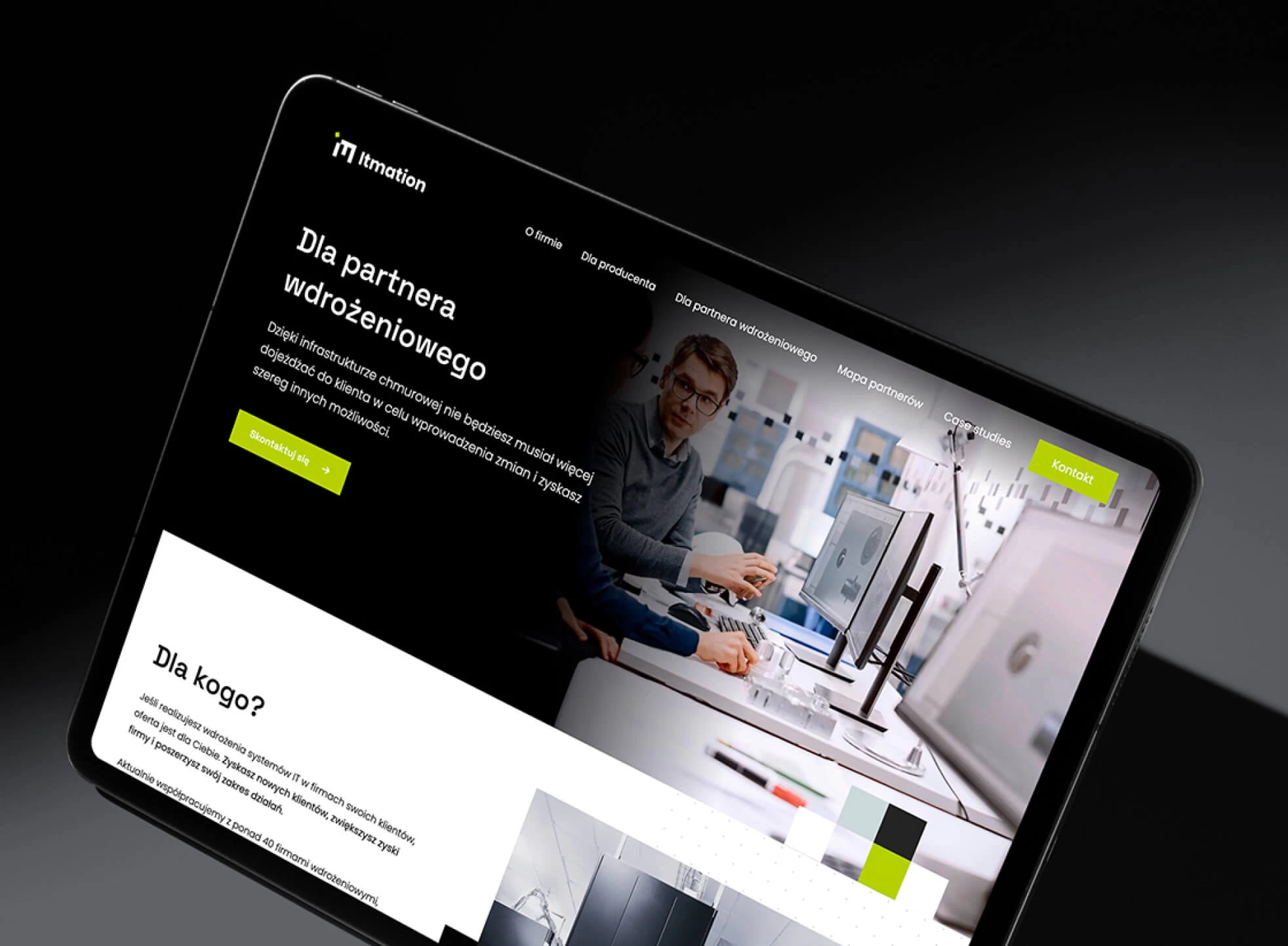


A specific and understandable website for different target groups. The created website is a tool for salespeople who can refer potential customers to it.

Hildegardis Art – spelt and mysticism in one design for e-commerce
STAGE / 01.1 BRANDING
Hildegardis Art
What was our challenge? To construct and develop a strong brand with the goal of becoming a market leader in the St. Hildegard recommended products area.
Competitive analysis, Key-visual, Communication strategy, Visual communication system, Image design.


Hildegardis Art is a health food store whose products also have a spiritual dimension. Our challenge was to create an image that is light, modern and interesting to the target group – regardless of beliefs.
We concentrated on properly defining the goals and developing a wireframe that considered the demands of various target groups. We created separate subpages for each of these groupings.
We carefully established the site’s aims and the personae it would target while working on the project charter and wireframe. We thoroughly examined Itmation’s cooperation models during the copywriting process so that we could explain them in a straightforward and understandable manner.
As a result, the redesigned site delivers Itmation’s collaboration offerings to each target audience in a simple, accessible, and easy-to-understand manner.
A specific and understandable website for different target groups. The created website is a tool for salespeople who can refer potential customers to it.

Aleno – solutions for restaurants and millions of customers consistently for over 7 years
STAGE / 01.2 PRODUCT DESIGN
Aleno
Our solutions for the leader in food service management systems.
User flow, Wireframe, Prototype, Visual design.

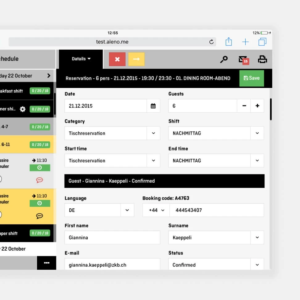
Our job? Building a highly flexible reservation system from the ground up, tailored to the needs of the industry. The key to success was the many elements of customization – from notifications, to customizing the look and feel to match restaurant branding, to food allergy questions.
We opted to work in weekly sprints to make the most of the client’s knowledge, experience, and data. We completely revamped the reservation process, generating UML diagrams that developers found essential.
We developed prototypes of the designed solutions and tested them with restaurant owners and customers. Finally, we completed a hand-off with a complete set of schematics and documentation. This made it possible to move on to the design of future system components with ease.
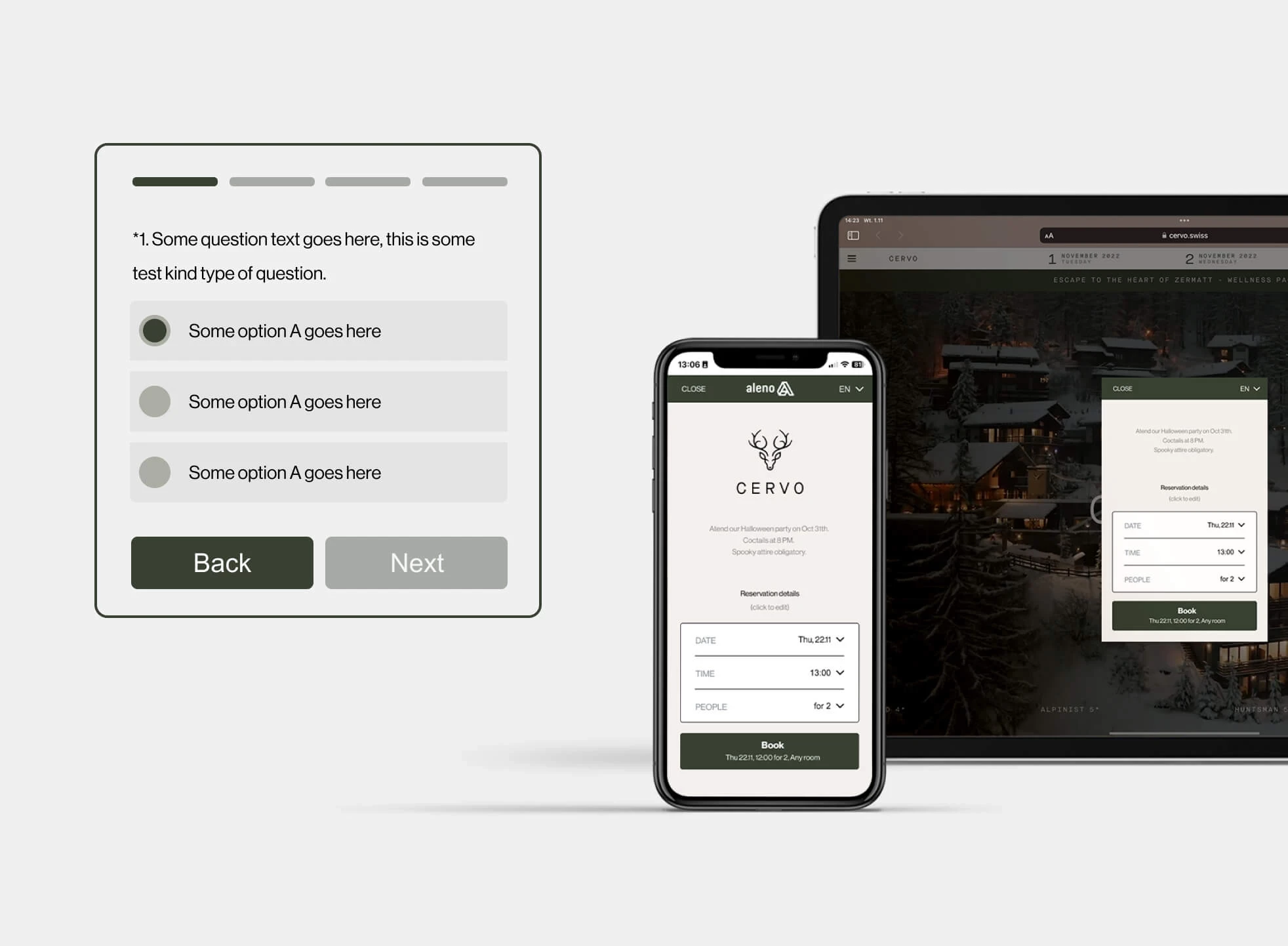
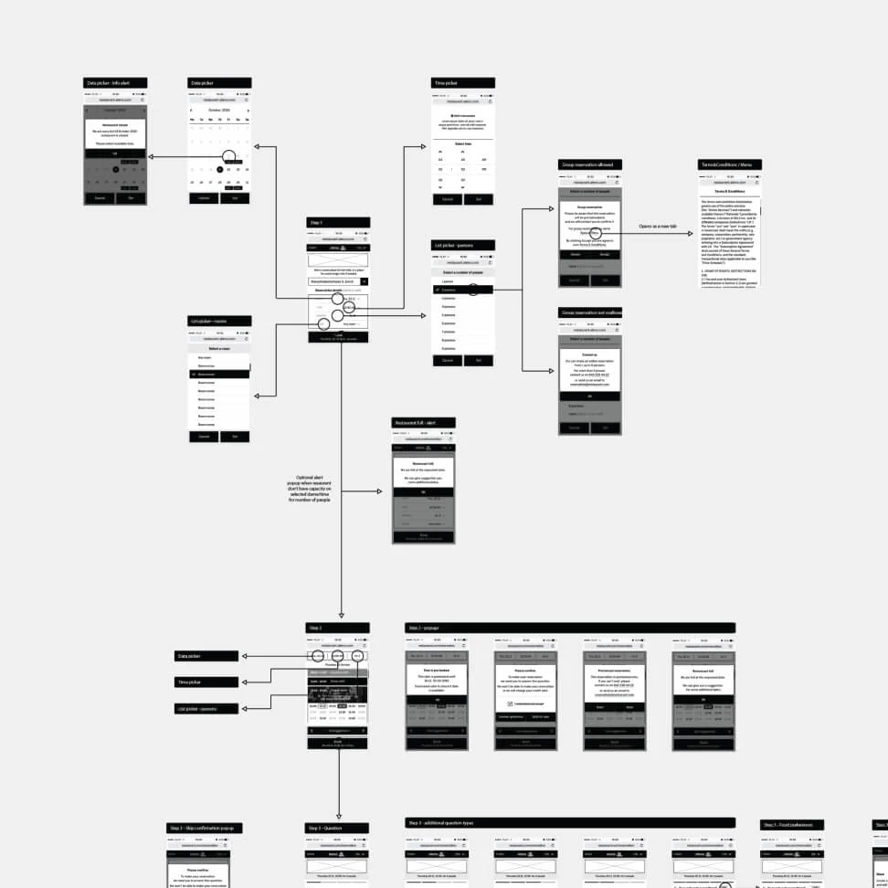

Our efforts yielded a reservation system, the operation scheme and the majority of the interface of which has remained unchanged for more than 7 years, serving several million customers per year. We created mutual trust during our collaboration, which allowed us to move quickly into the construction of two new system components.
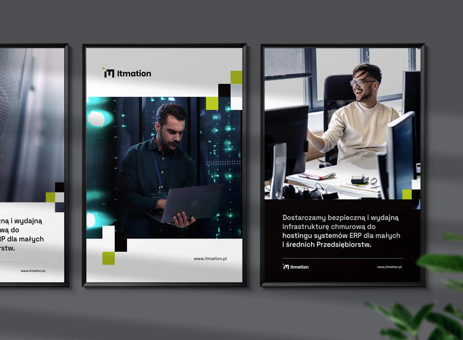
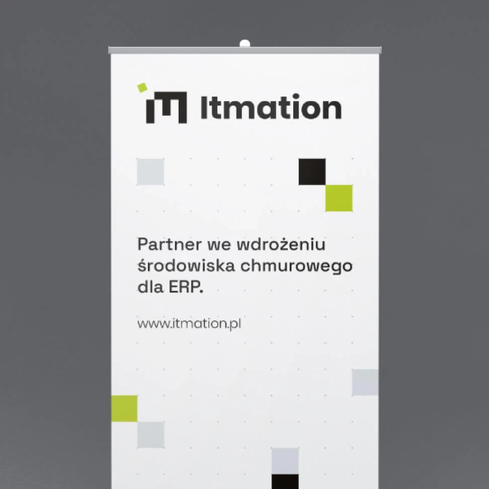
Itmation – Rebranding for ERP cloud service provider
STAGE / 01.1 BRANDING
Itmation
Itmation supports implementation partners and ERP and CRM software vendors with secure and flexible cloud hosting for business applications.
Brand Analysis, Communication Strategy, Key Visual, Visual Communication System, Logo Design, Copywriting.


Our task was to comprehend how the client functions in the market, its procedures, and the interdependencies among the organizations with which it interacts on a regular basis.
Through numerous conversations with the client and competitive analysis, we were able to gather knowledge about the brand. We learned about its business, the services it offers and its position in the market compared to the competition. Based on this, we developed a communication strategy, defining the brand’s unique characteristics and personality.
The graphic motif is based on squares arranged on a special grid. The composition is flexible and scalable, allowing the brand to grow in the future. So is the hosting service offered by Itmation.
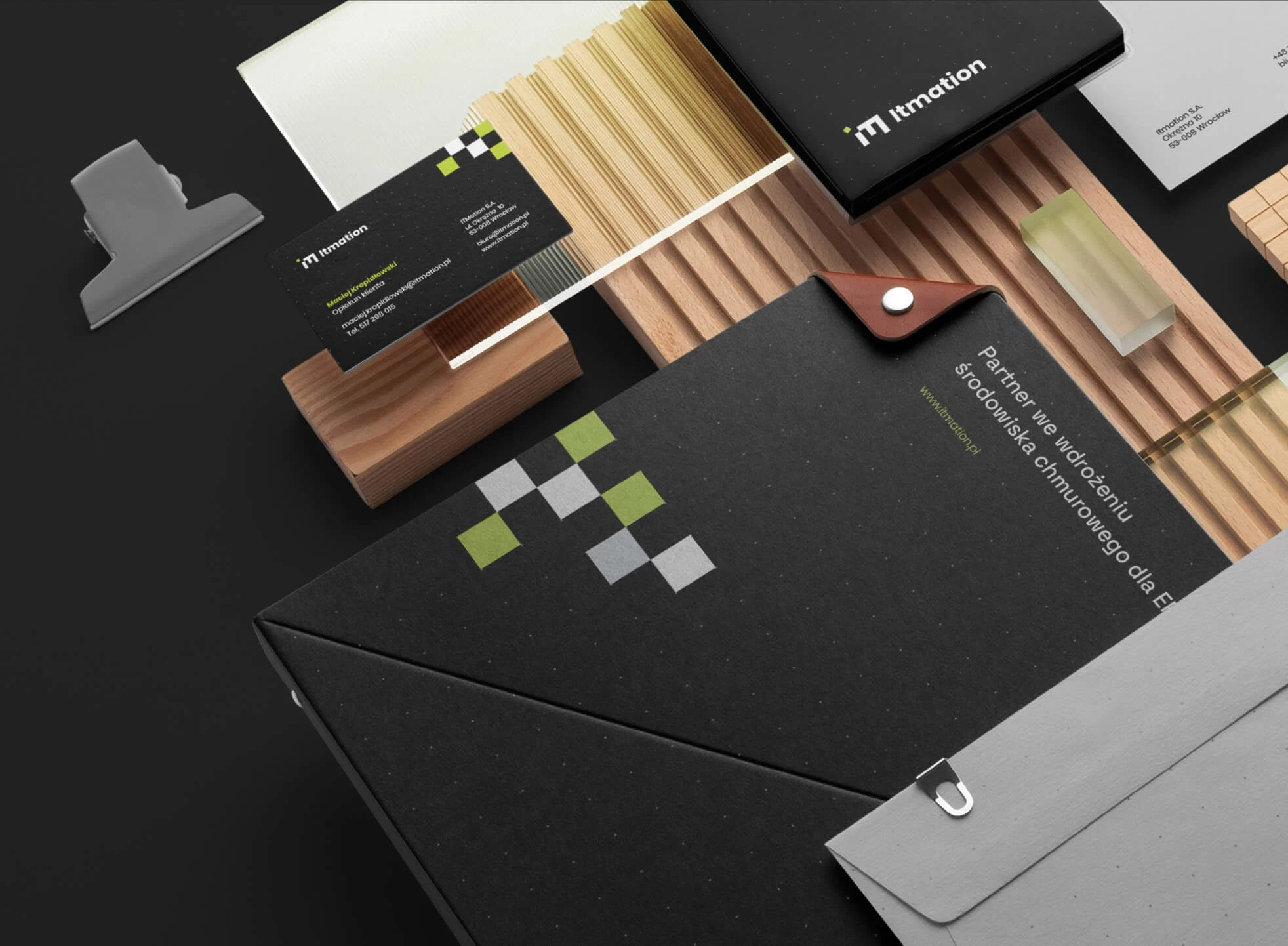

- The branding theme was implemented at multiple points of contact, creating a consistent and professional look.
- The Itmation brand has gained greater recognition and clearly stands out from the competition.
- An established design theme enables the creation of future materials in a consistent and thoughtful manner.

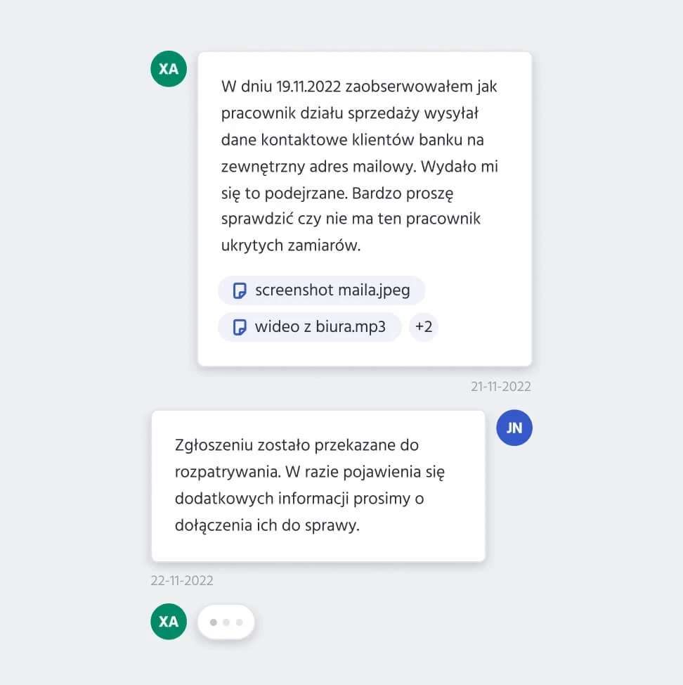
Mercurius – Whistleblowing Platform’s MVP
STAGE / 01.2 PRODUCT DESIGN
Mercurius
The platform is designed for "Whistlers," or employees who bravely disclose workplace issues. The client who approached us about this project had broad and extensive technology requirements, but the budget was severely constrained and the scope of work was not yet fully specified.
Workshops, MVP development, Wireframe, User Interface (UI).


- Prioritize the project.
- Understand the specifics of document management and maintaining anonymity on the platform.
- Matching the scope of work and results to the client’s budget.
The initial step was to plan workshops. They assisted us in comprehending the client’s industry and the issues we encountered. The session was critical since it allowed us to develop modification recommendations, which was especially important given our limited budget.
The primary goal was to create the platform’s new information architecture and specify views that the development team could easily implement. Thanks to our understanding of the client’s needs, we were able to complete the process in less than 65 hours.
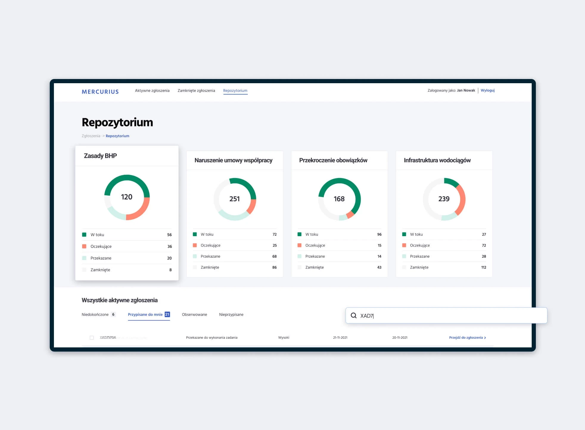

- The project completed the process in less than 65 hours.
- Successful implementation of the first version of the platform.

PiastClinic – from a dental office to a full-service clinic
STAGE / 01.1 BRANDING
PiastClinic
We have worked with the PiastDent brand for years. Through continuous development and market demand, the client decided to expand services to include aesthetic medicine and osteopathy treatments.
Brand Analysis, Communication Strategy, Key Visual, Visual Communication System, Logo Design, Copywriting.
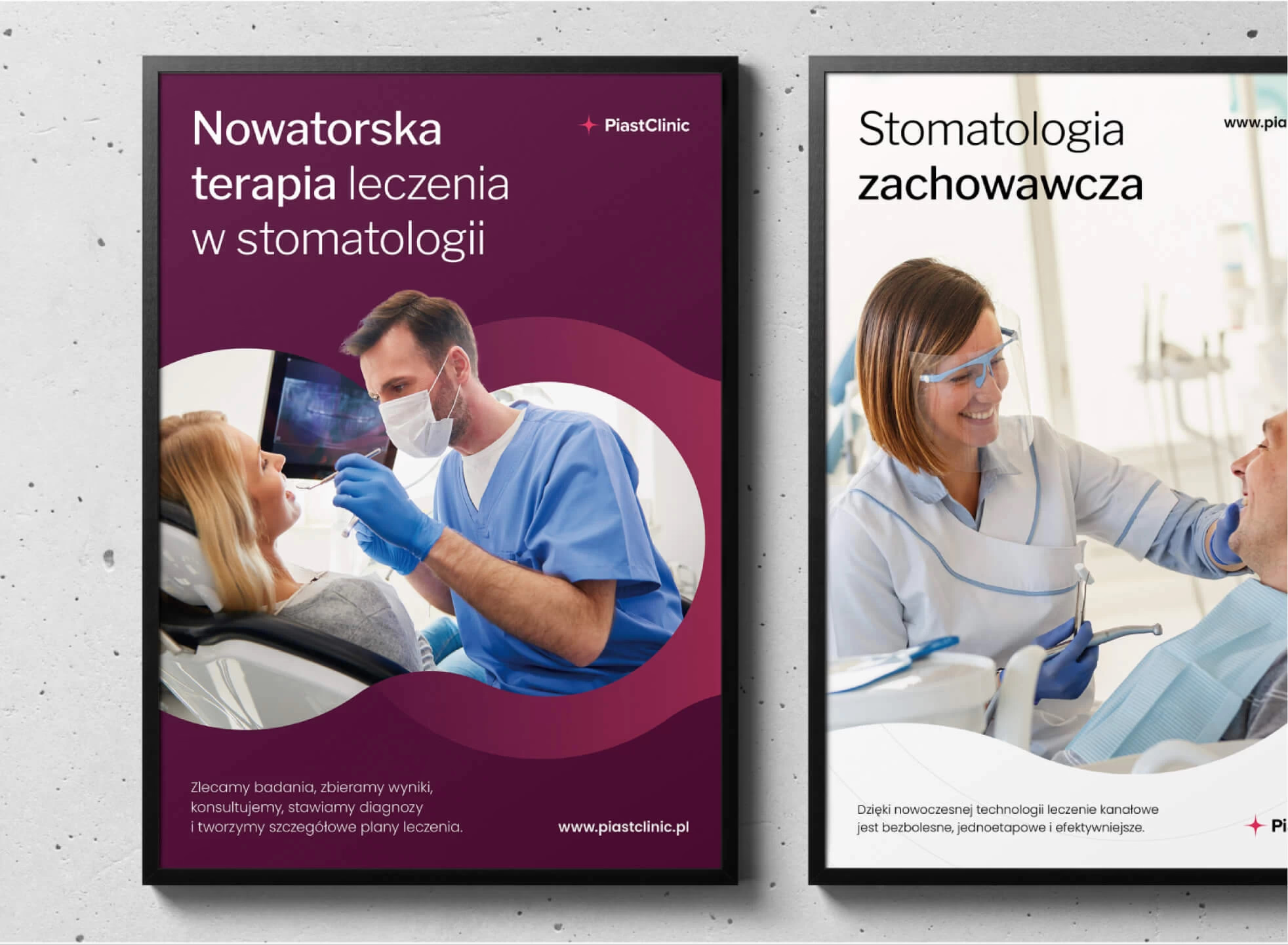


How do you turn a dental office into a clinic with a wide range of services without losing the trust of existing customers?
We learned about the client’s vision and plans for growth during our discussions. We learned about the industry and how other companies communicated by analyzing the competitors.
We concentrated on retaining portions of the image when working on it so that current customers would still recognize the brand after the rebranding. The image was then enlarged with additional features.
The concept of communication is directly related to the brand’s action, which addresses the root cause of a specific situation holistically. In its business, the brand emphasizes a comprehensive and innovative approach to medicine.
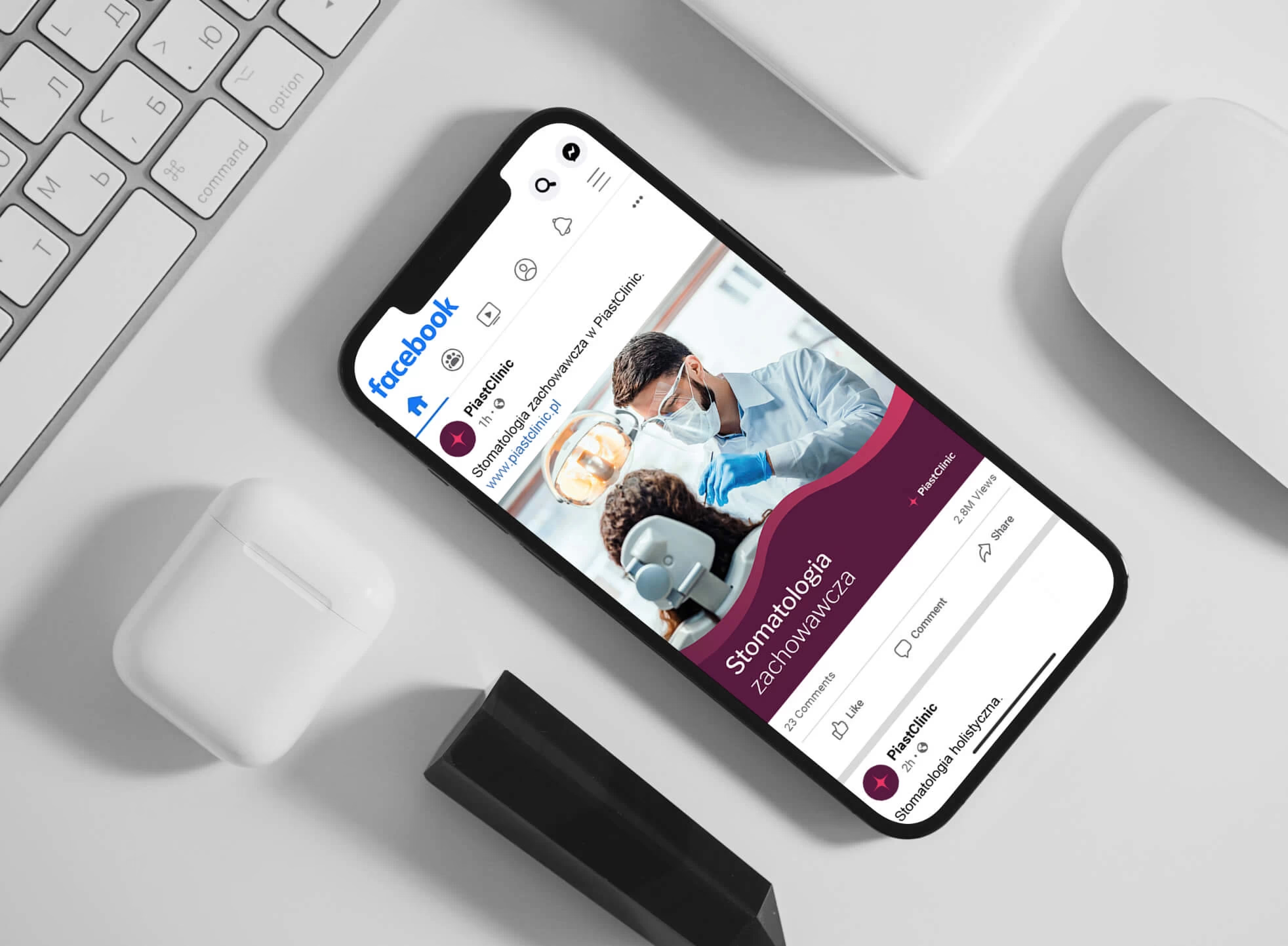


- A refreshed look to match the company’s current operations
- Graphic style as a basis for further marketing efforts

Polanica Park – website with intuitive housing selection
STAGE / 02.1 WEBSITES
Polanica Park
We designed and developed the Polanica Park website, which presents an offer of investment apartments in Polanica-Zdrój. We used the branding we had previously created.
Wireframe, Copywriting, Graphic design, Development
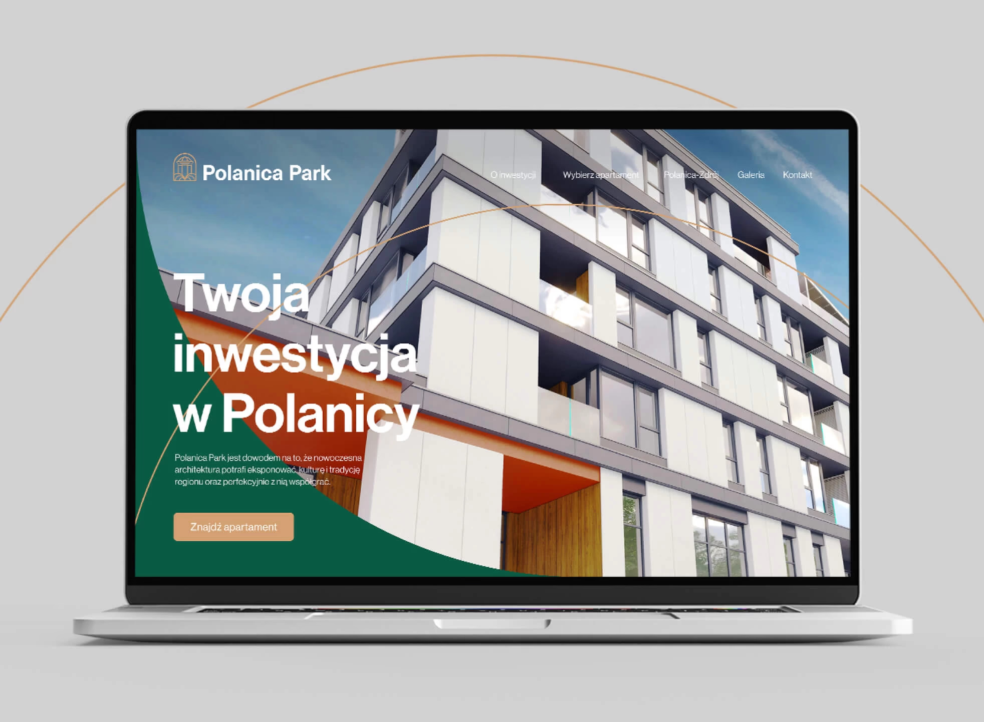


Bringing the client’s business model along with its differentiators (locality, affection for the region, and collaboration with local subcontractors). The task was to display everything in an understandable manner.
We determined all of the information that should be on the site and meticulously designed its organization. The material was subsequently assigned to various sections of the website. We built everything around the demands of the target audiences.
We developed the goal content for the site based on negotiations with the customer, and finalized the project with visual design and site launch
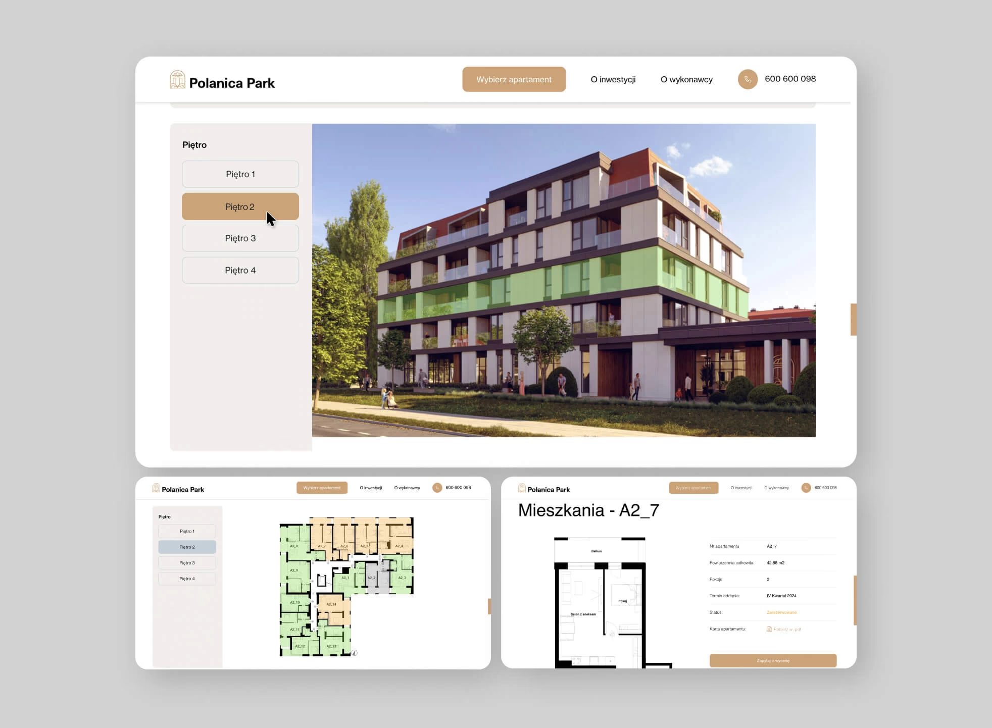


The Polanica Park website is the main point of contact with customers, providing them with necessary information and encouraging them to get in touch with the vendor.

Industria24 – from stationary store to million online revenue
STAGE / 02.2 E-COMMERCE
Industria24
The story of our cooperation with Industria24 - one of the largest e-commercials selling tools in Poland.
UX audit, Client workshops, UX Design, Web development.
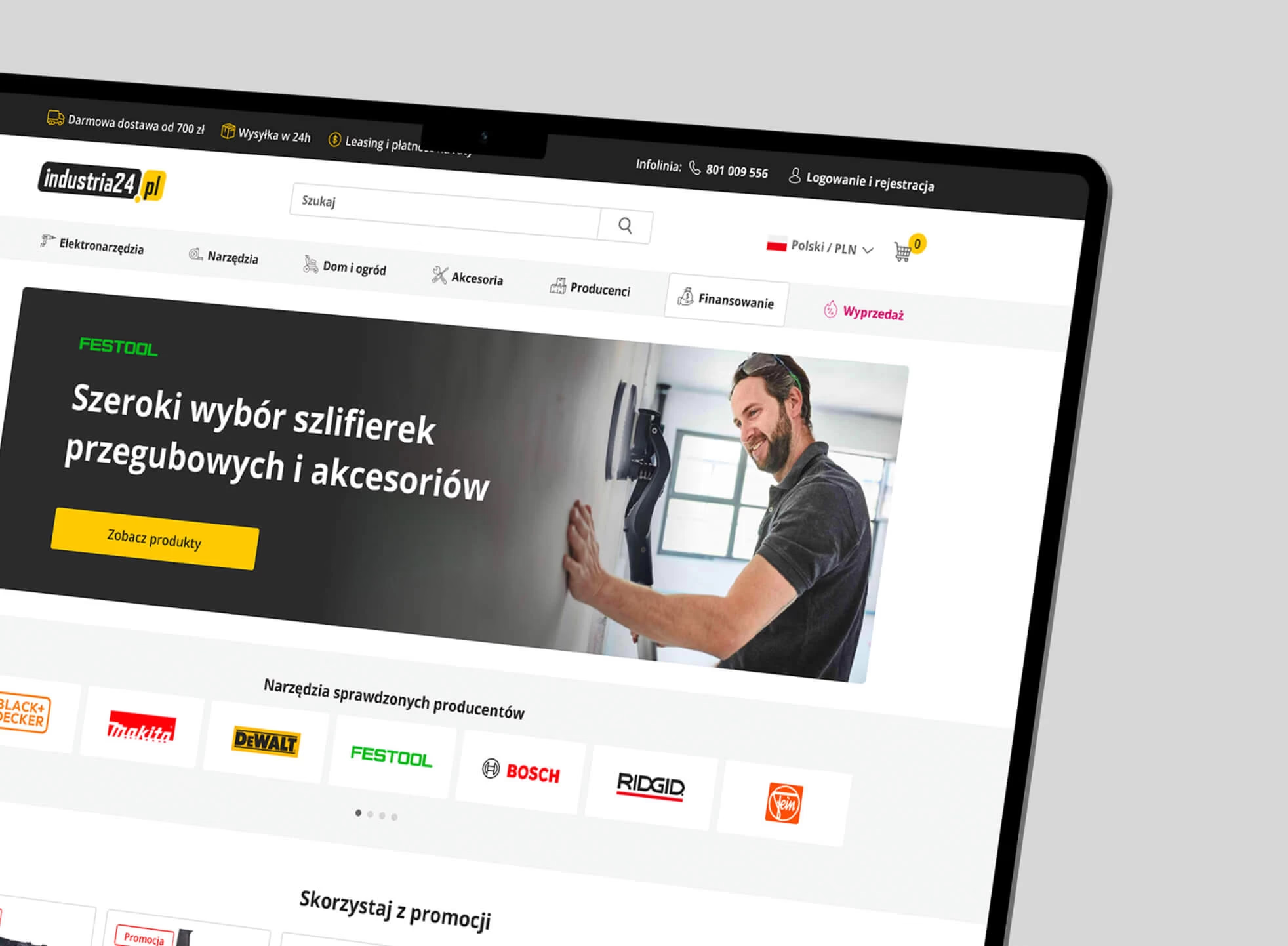


Magento platform implementations can sometimes be challenging. Designed with close collaboration between developers, designers and the client, they must meet business objectives and (of course) be done within budget.
Based on the audit and workshops with customers, it is possible to find the most critical points and develop implemented solutions using ready-made modules, which significantly reduces implementation costs.


- Redesigning the purchasing process
- Noticeable marketing benefits
- Refresh the look of the store